MOM’S
Chicago’s japanese comfort food
Case Study by Fire Signs LLC, Ashlee Stewack and Alec Ozawa
All artwork, design, and photography is property of Fire Signs LLC.
In 2019, we got the call from our chef and chef, Kelly Ijichi who was opening their first restaurant in sweet home Chicago. The specialty is Japanese comfort food, and they needed the full package from logo to media production.
Here’s a look at the work we created for Mom’s.
Challenge:
Create Mom’s brand and visual direction.
deliverables:
Brand identity
Logo
Photography
Printed menus and business collateral
Social media campaign
Merch design and production
Restaurant menu painting
Event support and design
Concept:
Mom’s Chicago

“Kelly Ijichi is a Chicagoan and culinary graduate of Johnson and Wales University in Providence, Rhode Island. She has been engaged in the Chicago Japanese-American community her whole life and is passionate about sharing Japanese-American cuisine across the city. Before Mom's, Kelly worked at several Michelin-starred Chicago restaurants, and co-hosted a semi-regular pop up known as Hungry As F*ck. Mom's was founded in 2019.”
Brand
development
Designer: Ashlee Stewack
Collaborating with Kelly and Randi on this project has been exciting from the beginning. They brought a clear direction to the table that was hard not to feed off of. When meeting with the Mom’s initially to talk design, direction and overall goals for the brand, Kelly and Randi were initially drawn to us for Ashlee’s hand lettering and frequent nods to feminism in her design work. We touched on the inclusion of Japanese feminism and wanting this to be integrated into the brands story.
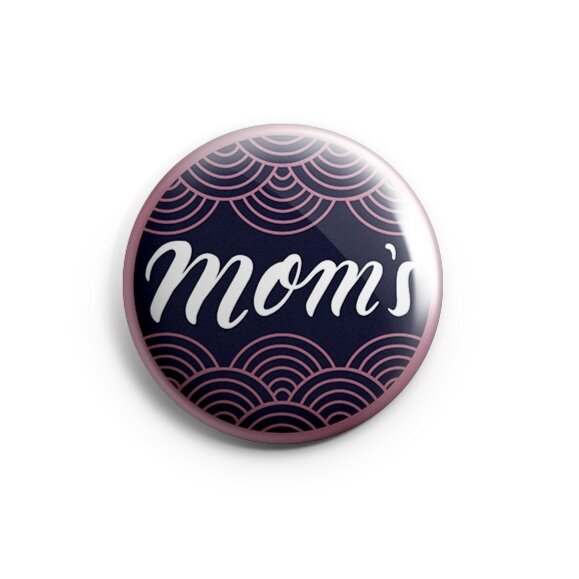
Going into the initial sketches, Ashlee’s goal was to blend this with the focus on Japanese comfort cuisine as well as reflect the professionalism of both Randy and Kelly’s experience as chefs. The final logo mark was decided on for it’s integration of the traditional Japanese “seigaiha” wave, this elevated the brands sophistication to match the Mom’s reputation, with addition of fun hand lettering with a little edge. For the lettering, we went with a thicker stroke to speak to the “comfort” food ethos.

Hand Painted Lantern


After rounds of research, we chose to take the approach of traditional Japanese signage. Typically painted vertically on lanterns and through neon Signs of Honk Kong, we took these as reference landing on a friendly, approachable and rounded serif typeface for the Mom’s menu and secondary identity elements. The marble choice was a tie-in to another Japanese craft of water marbling, otherwise known as Suminagashi.

Designed and hand painted menu to match Mom’s branding.
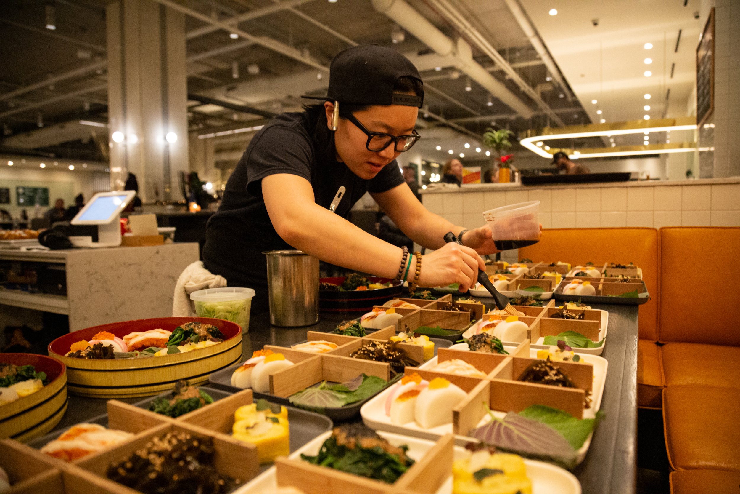
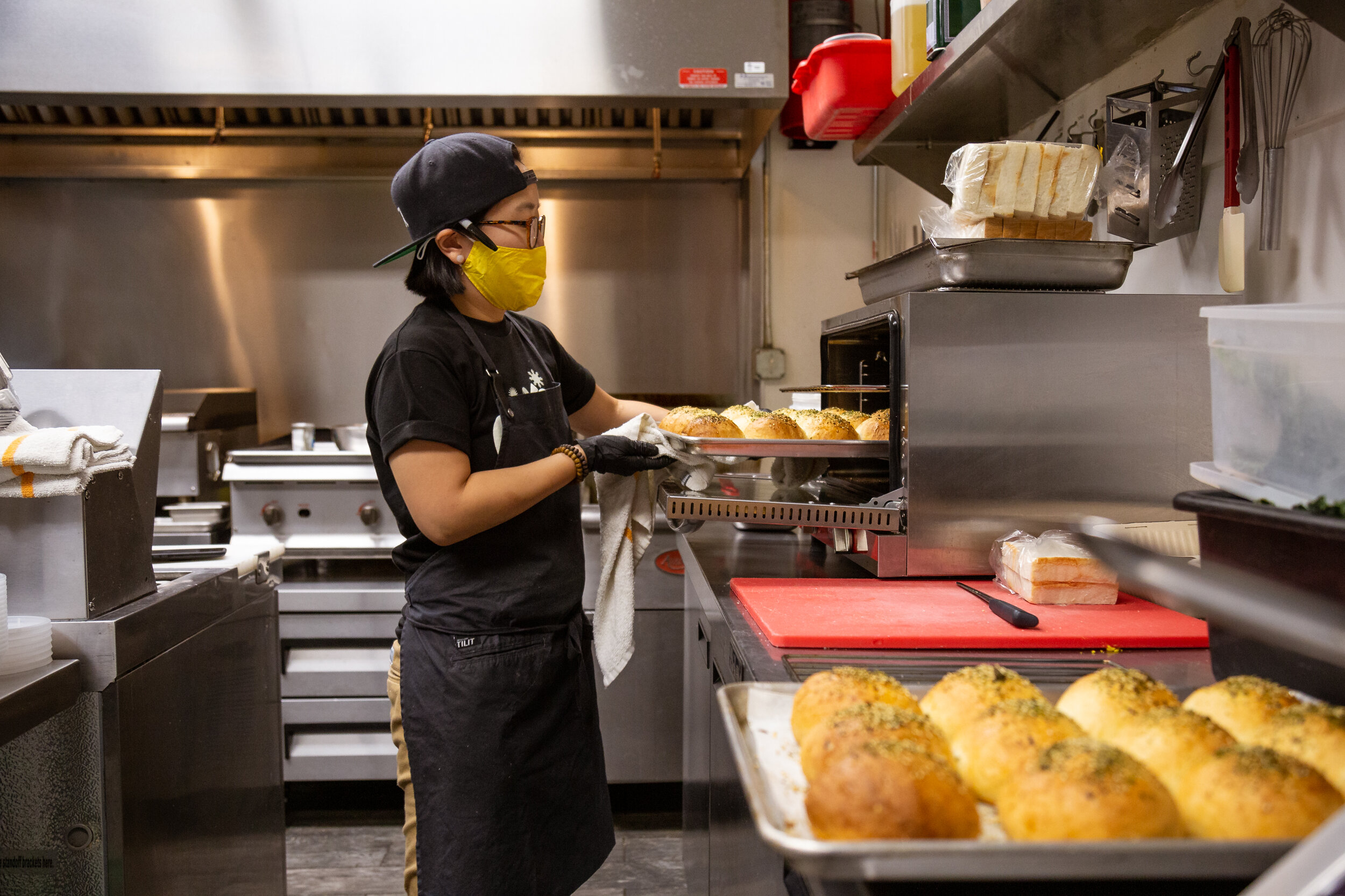
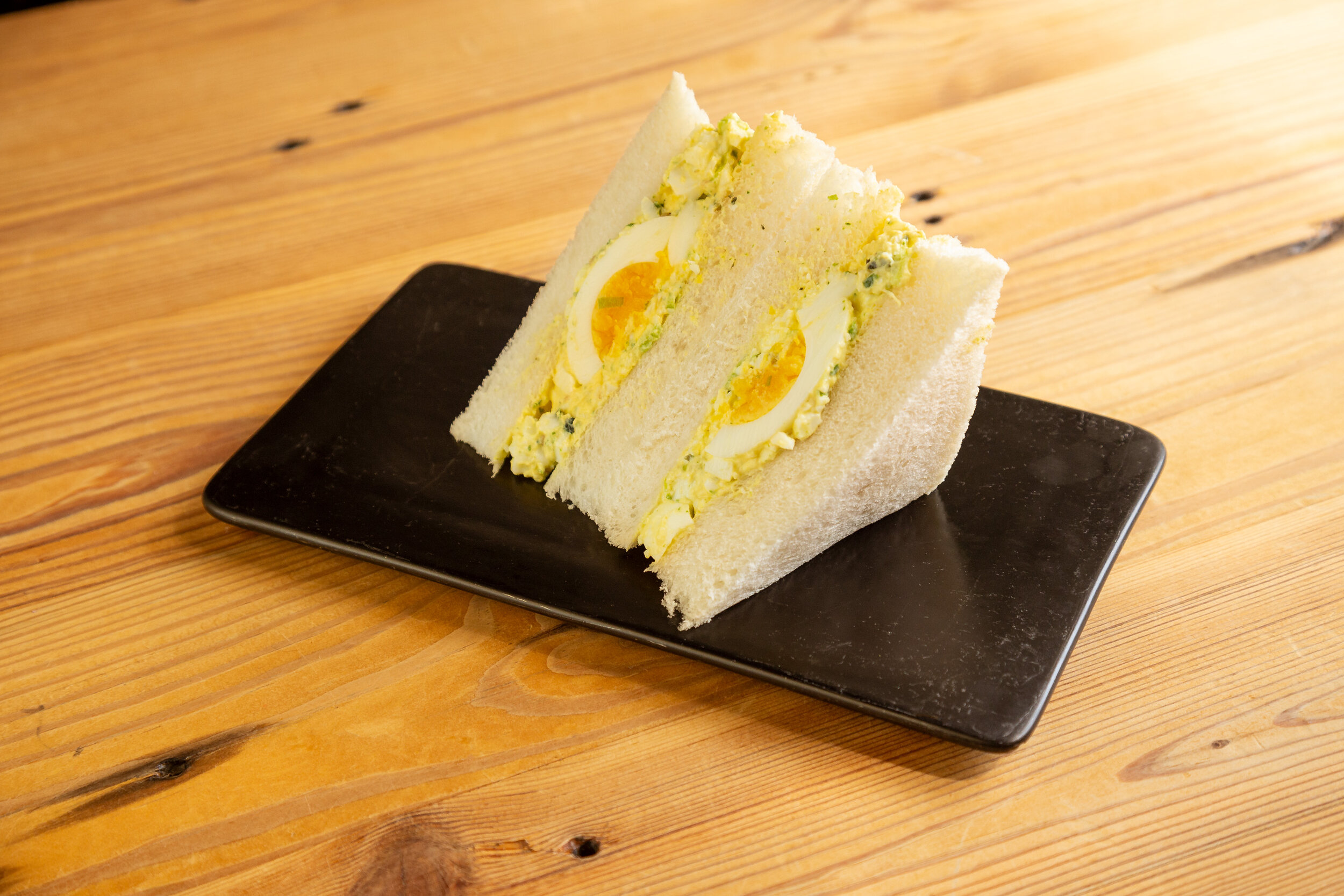
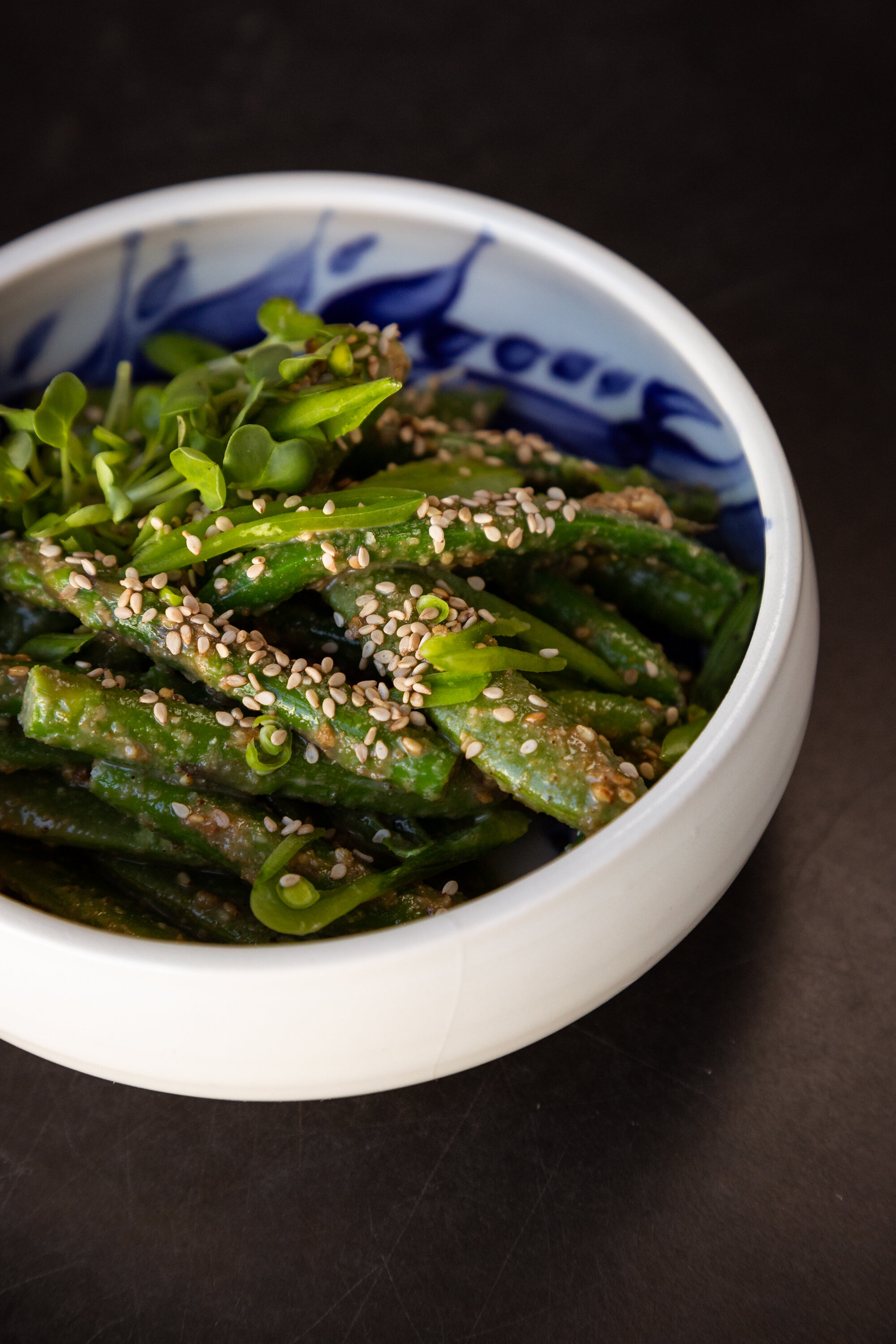
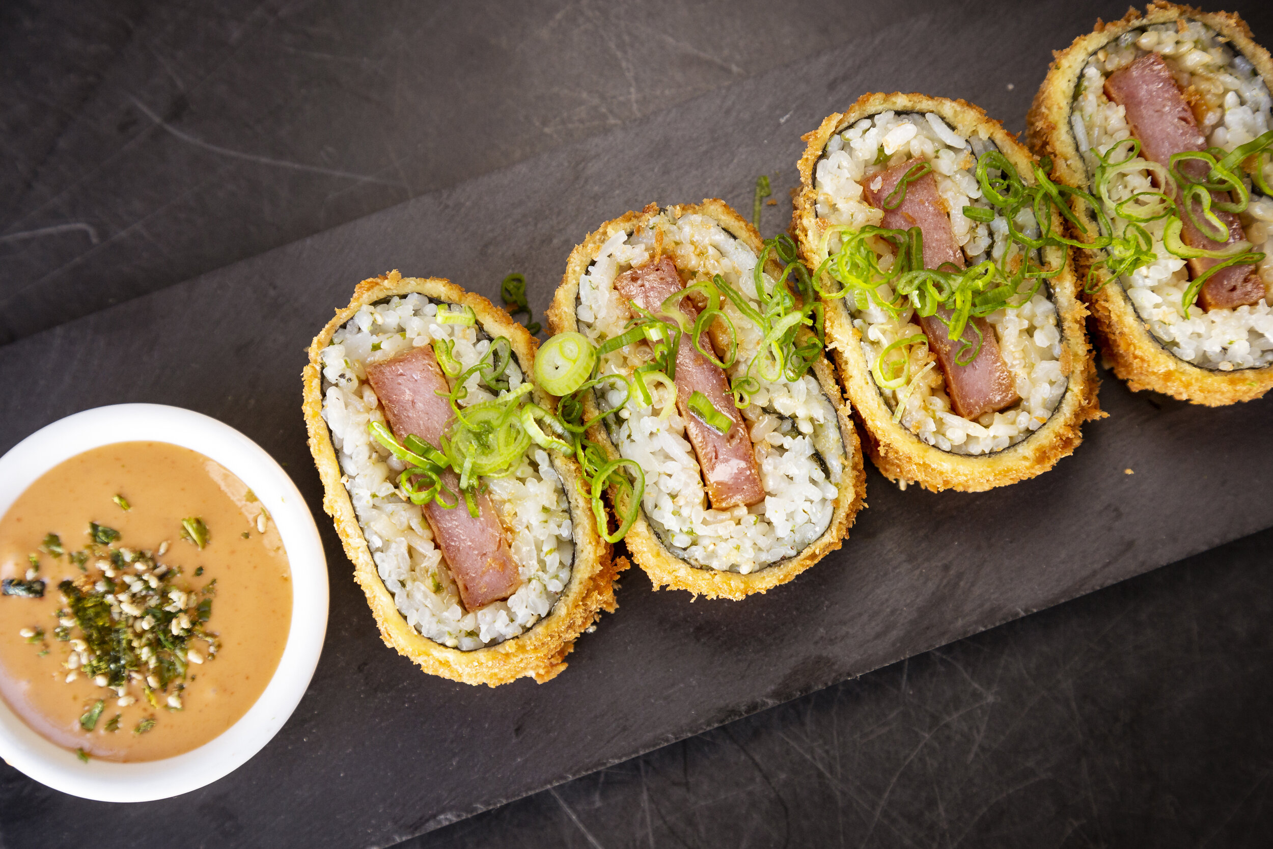
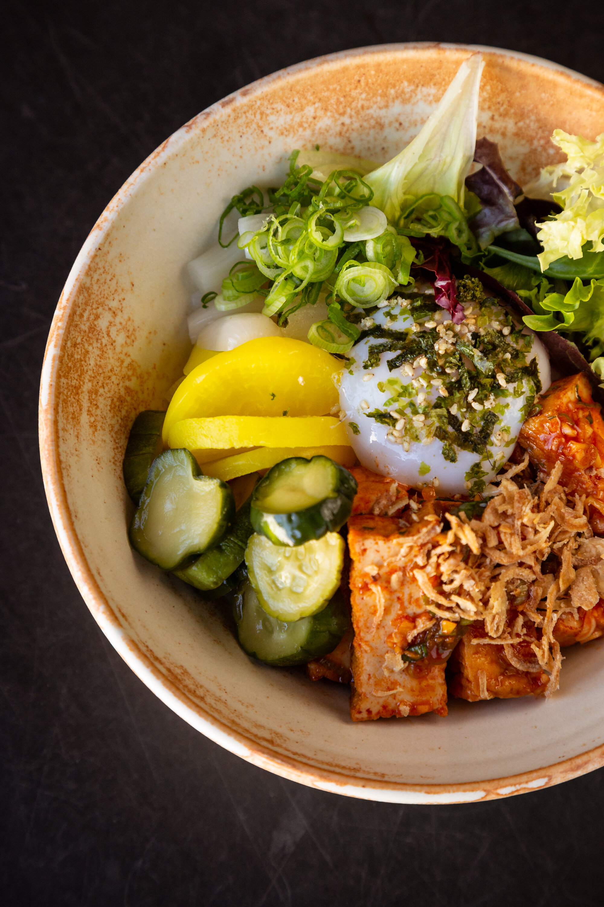
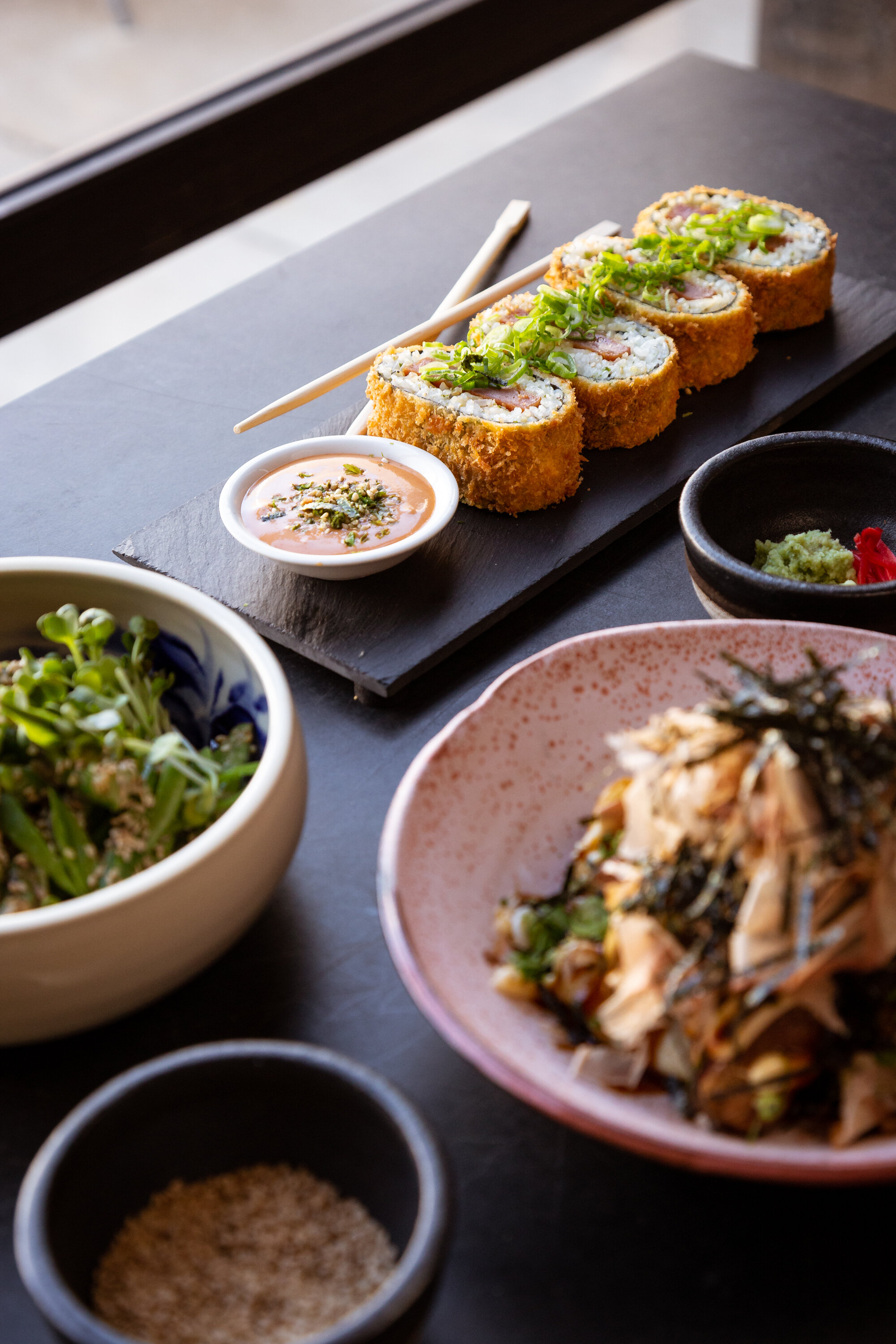
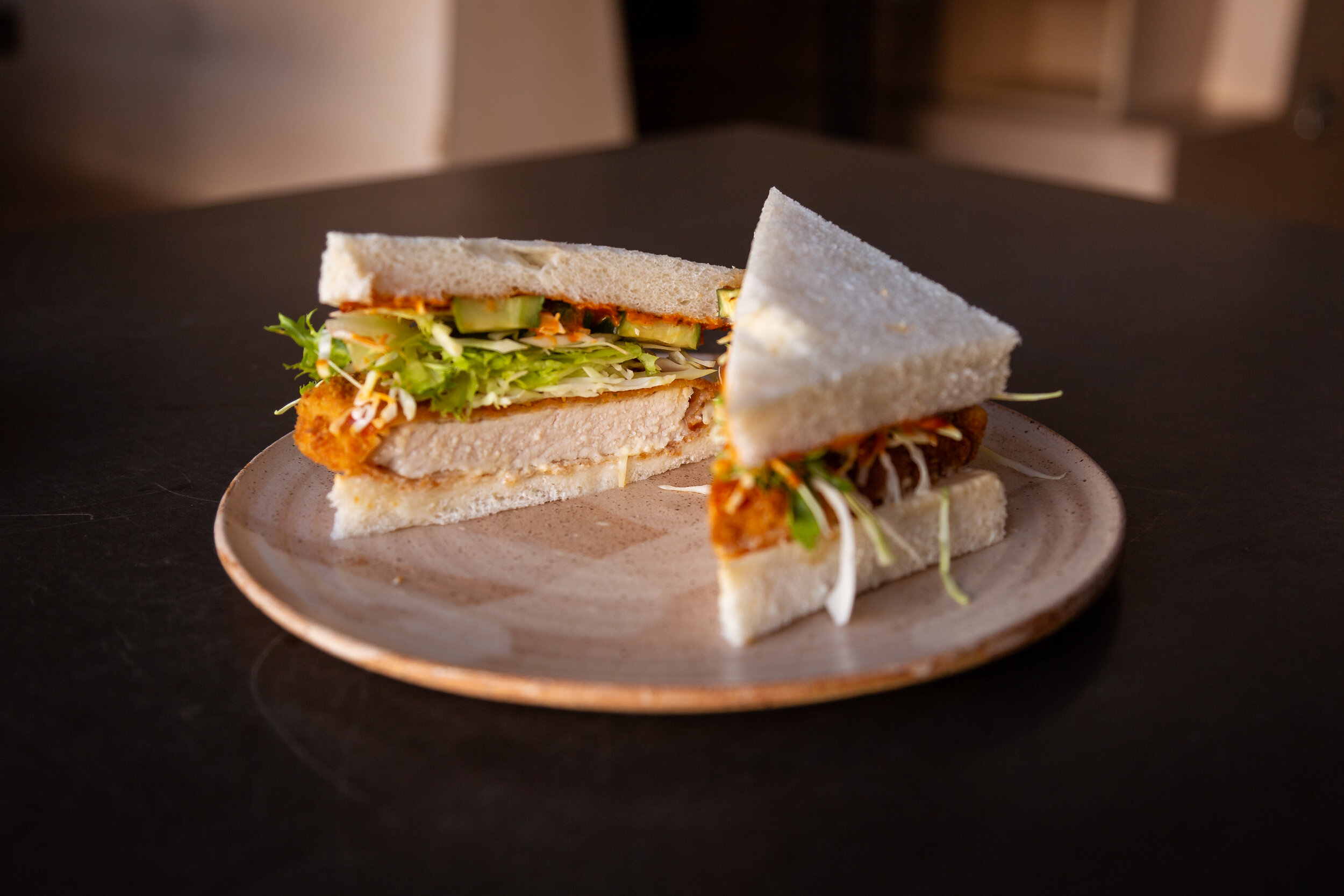
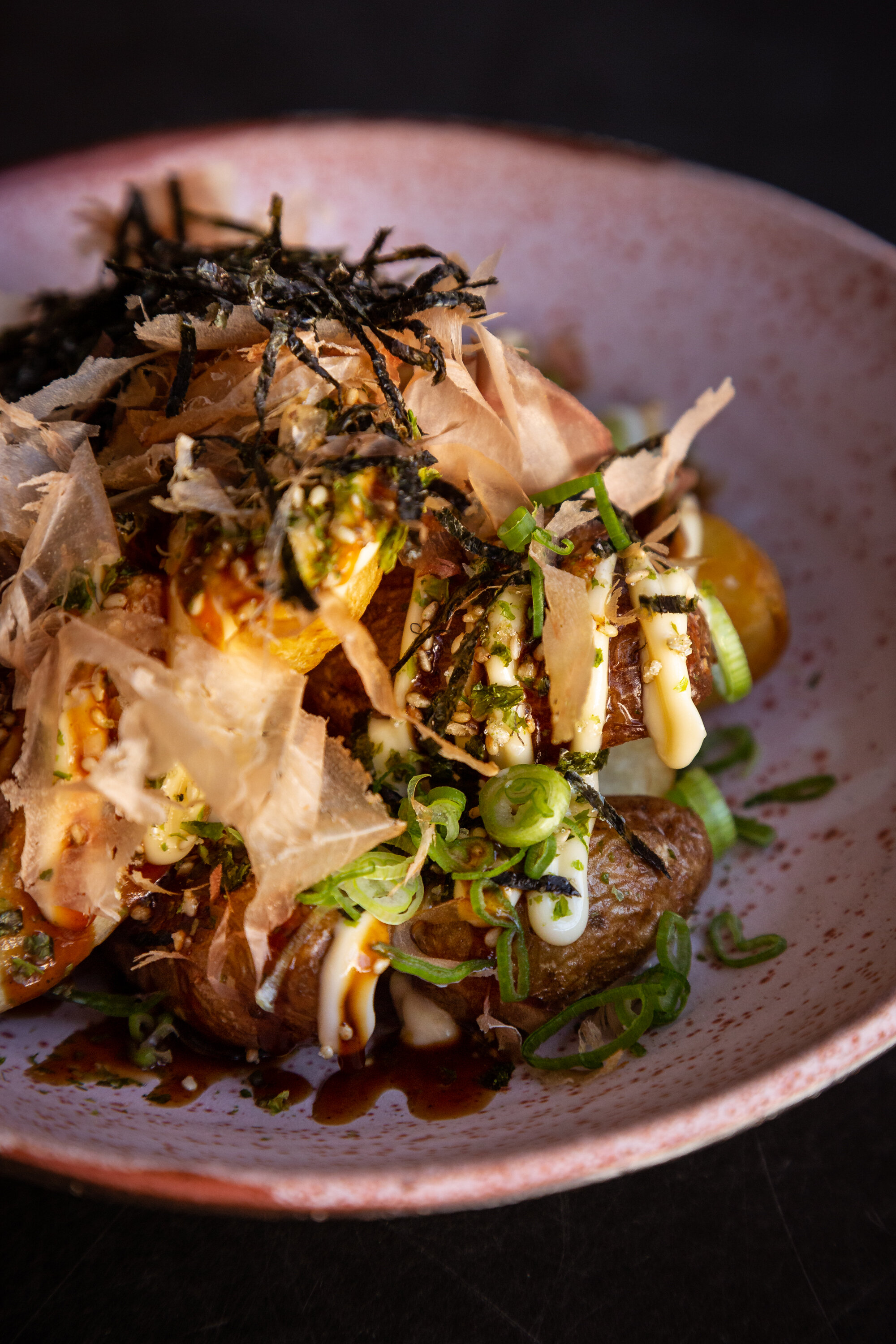
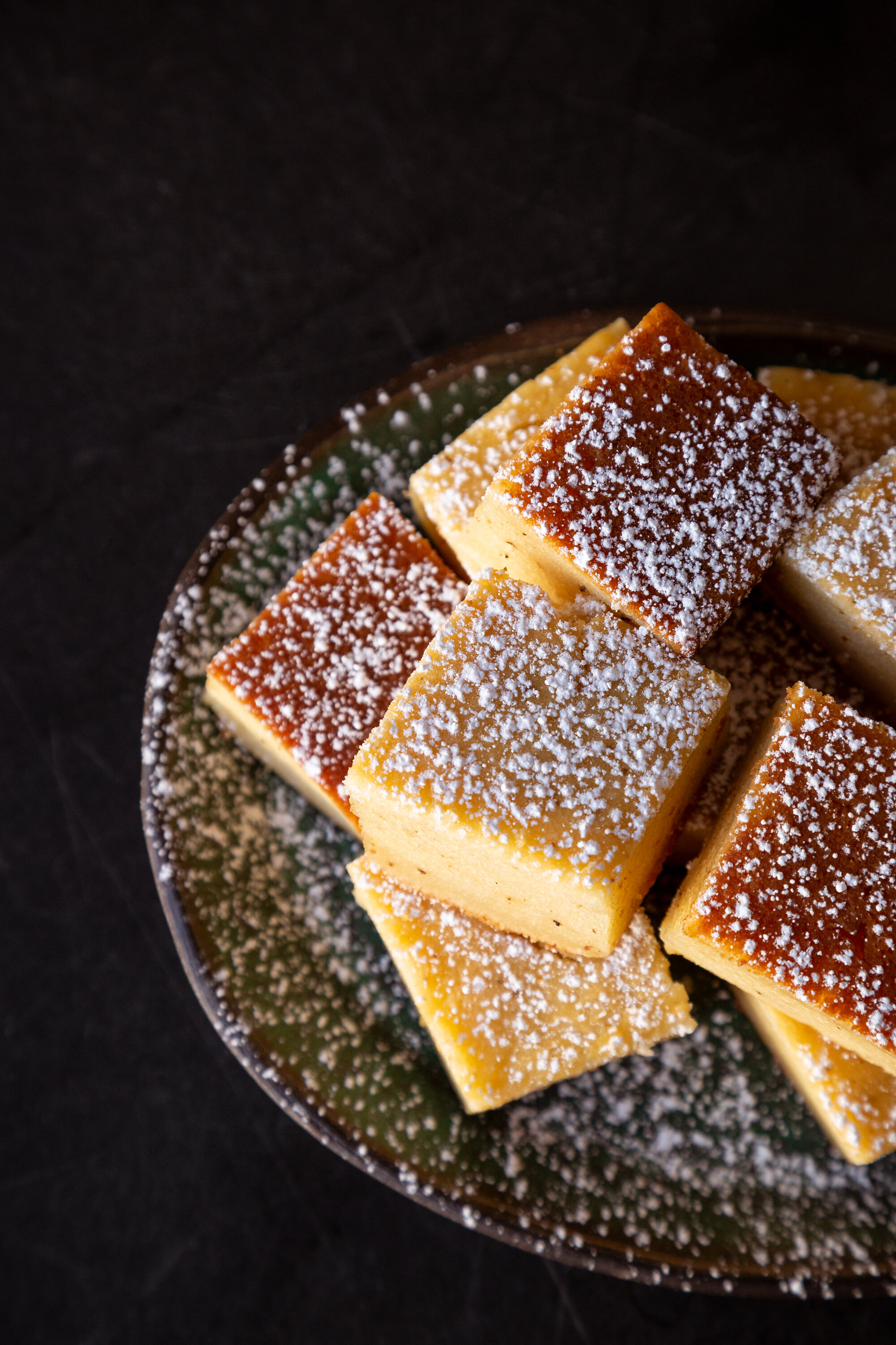
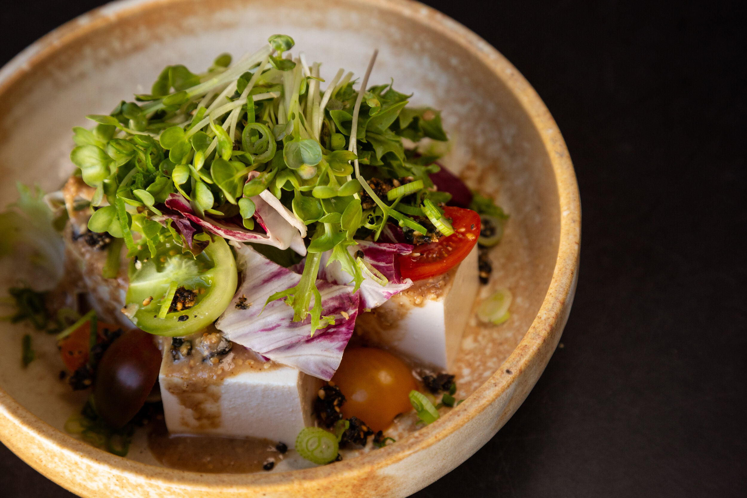
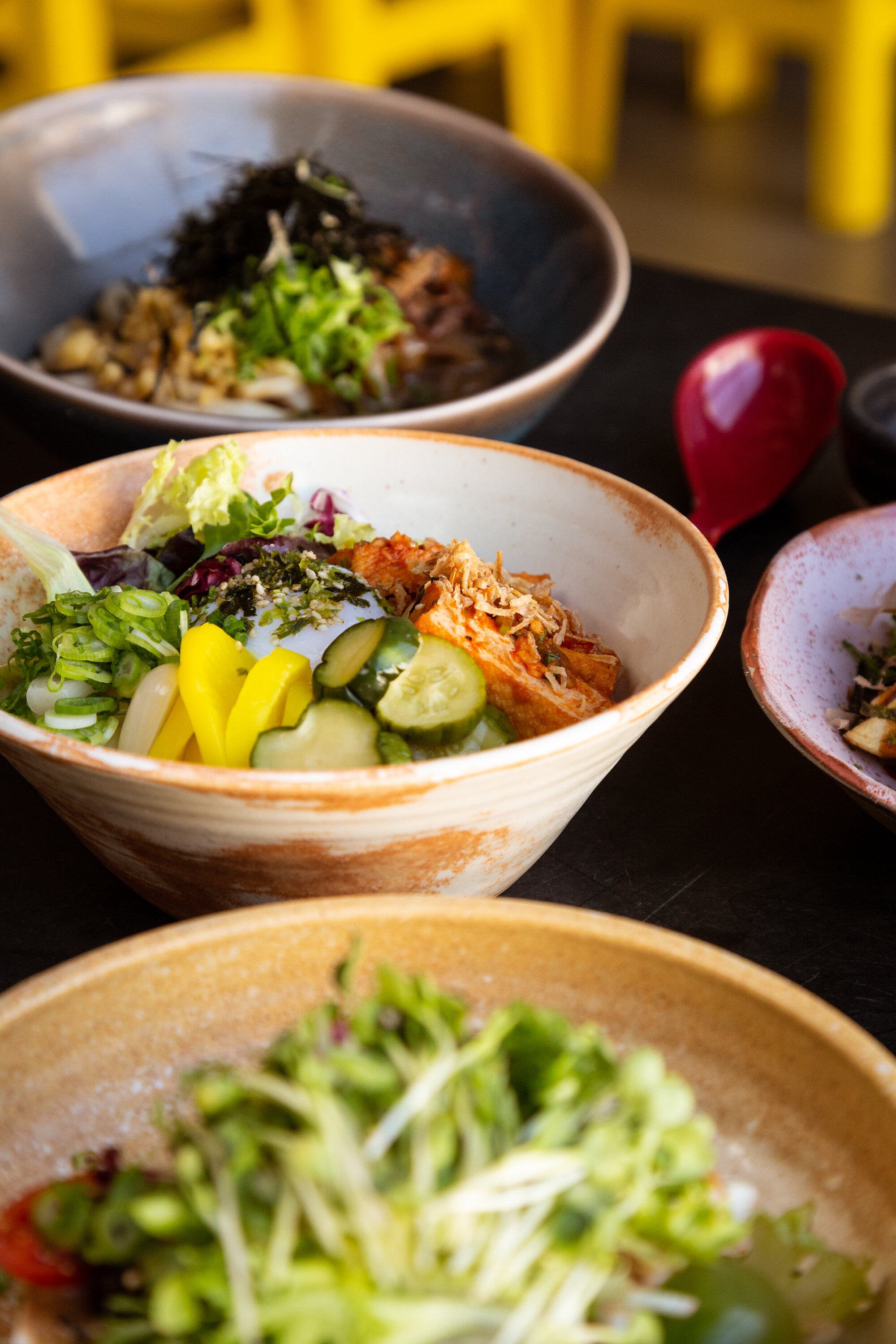
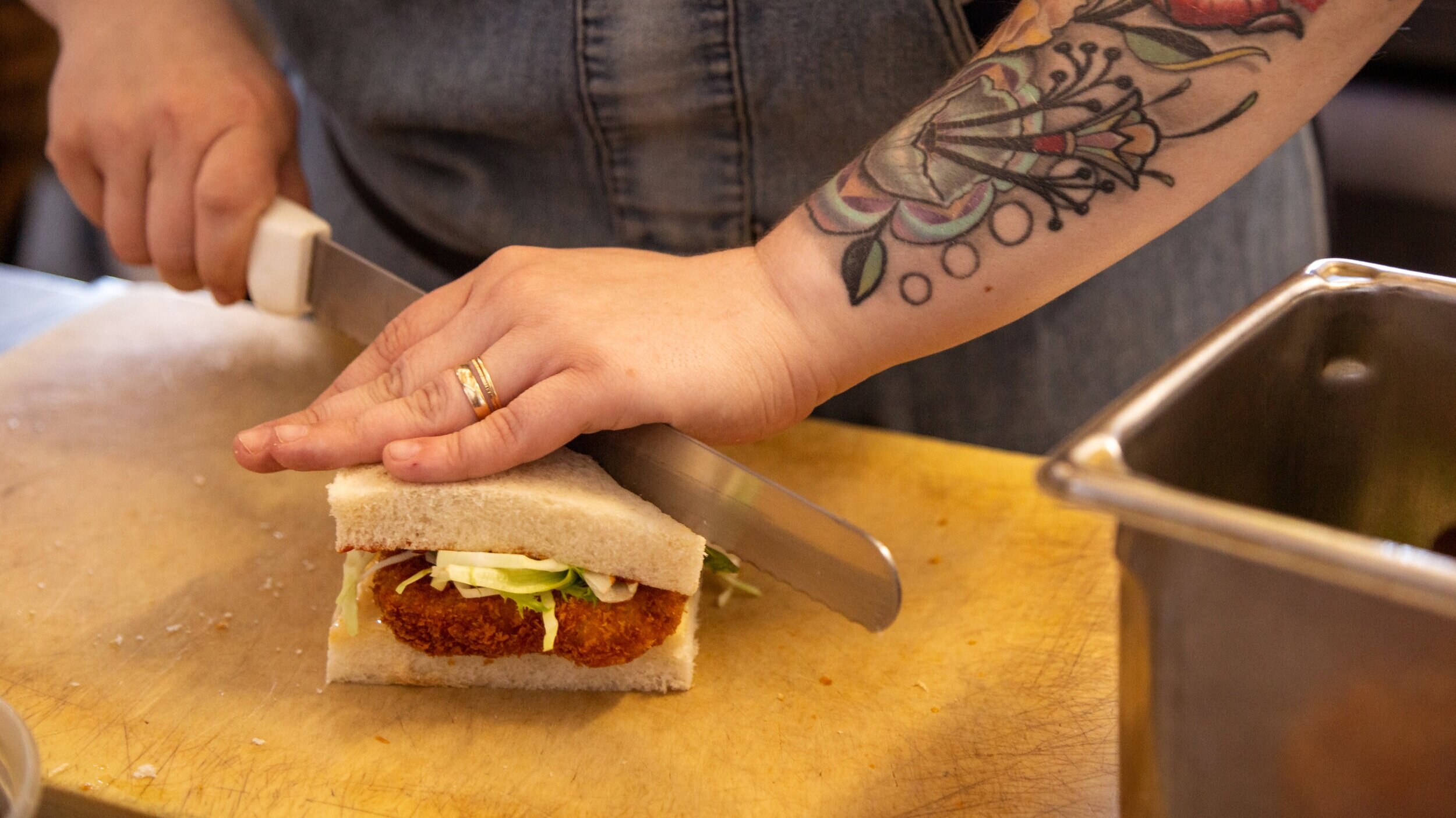
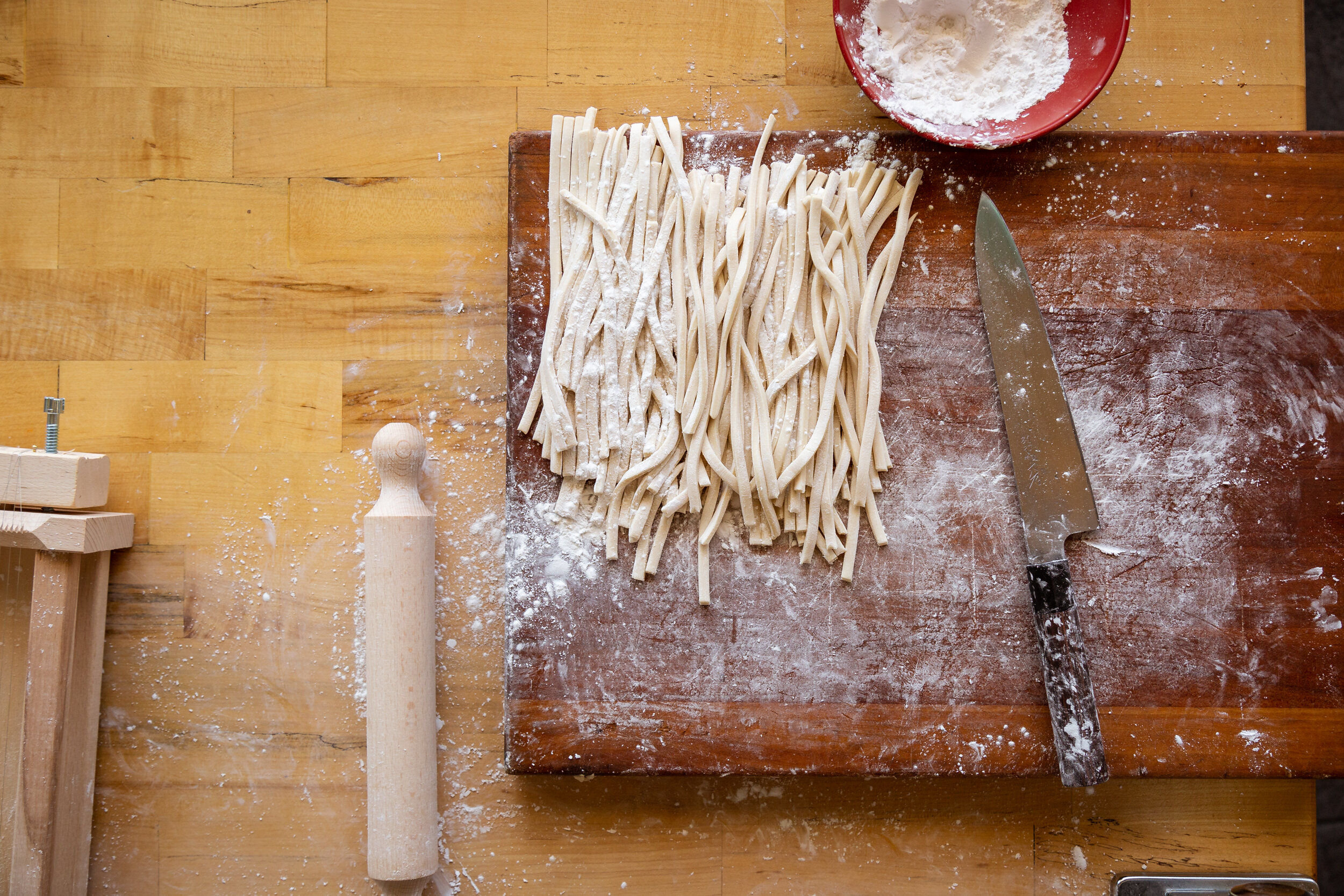
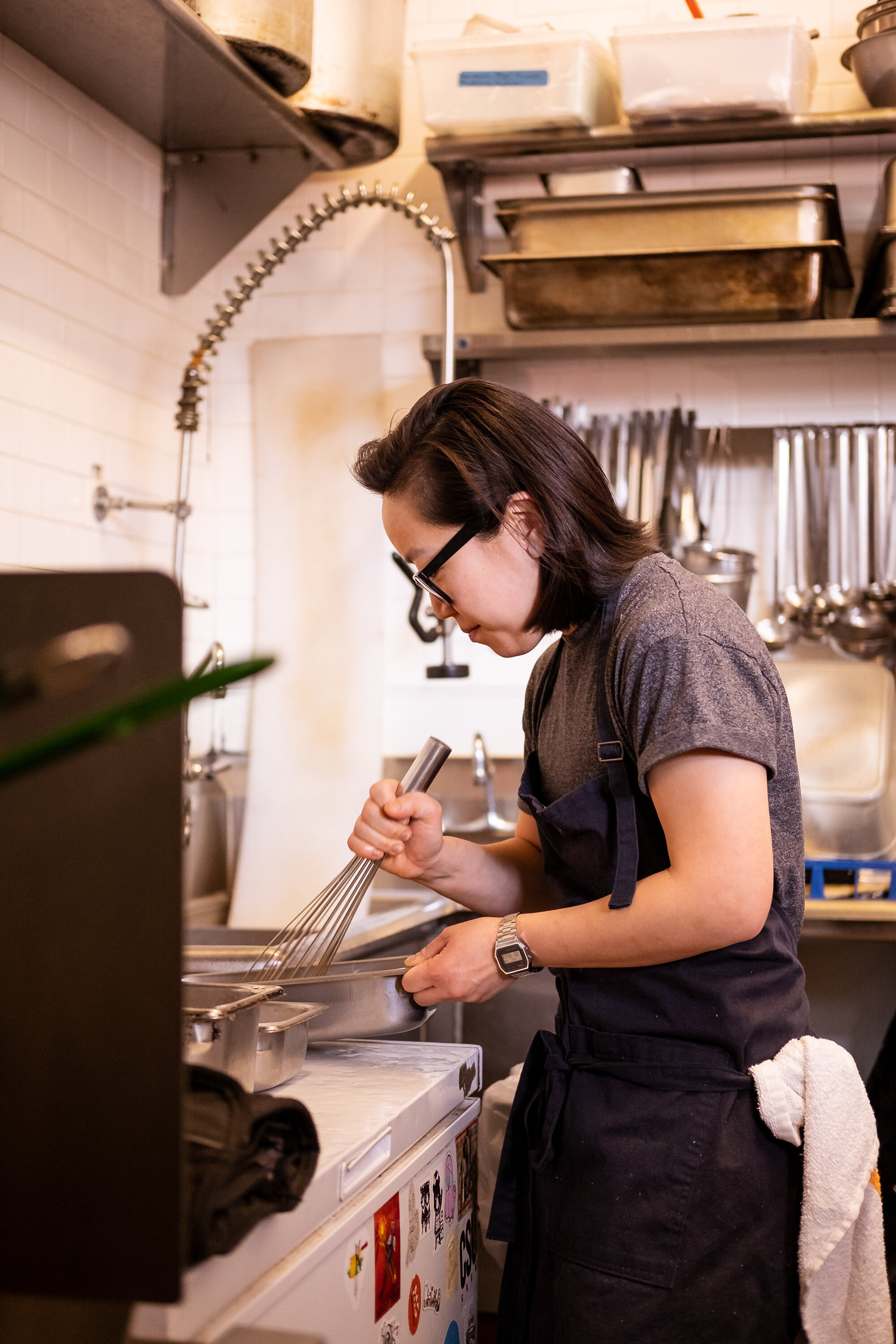
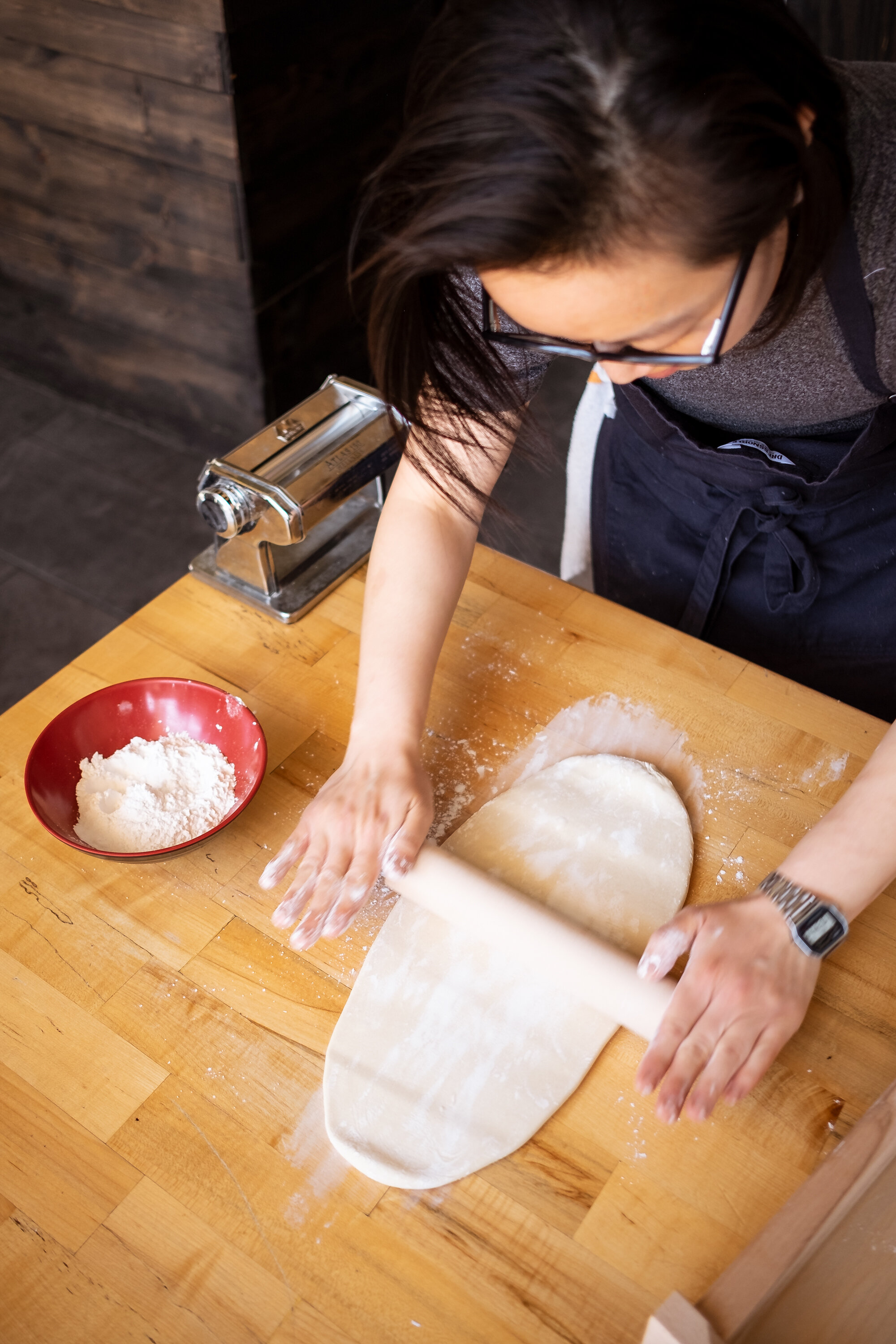
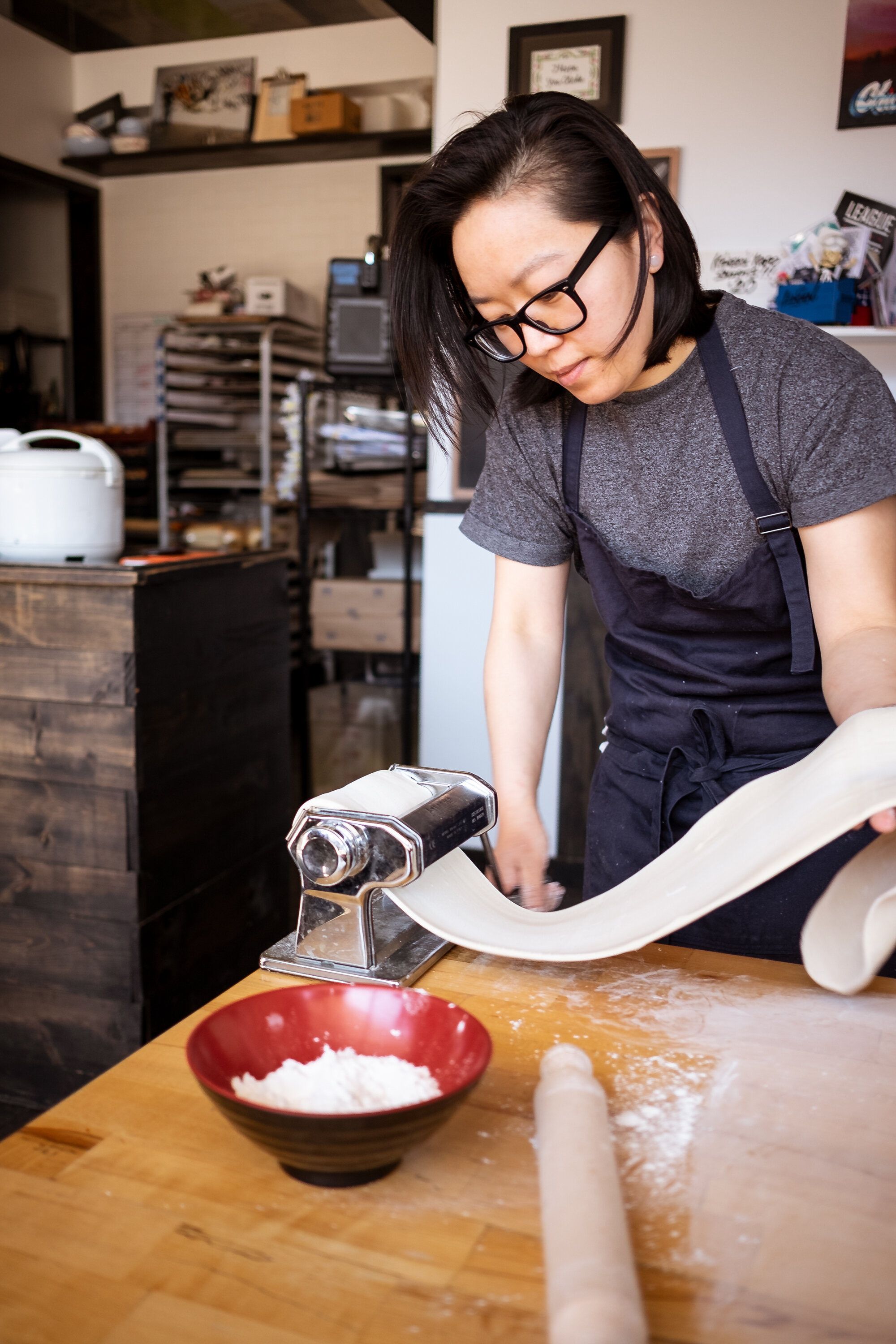
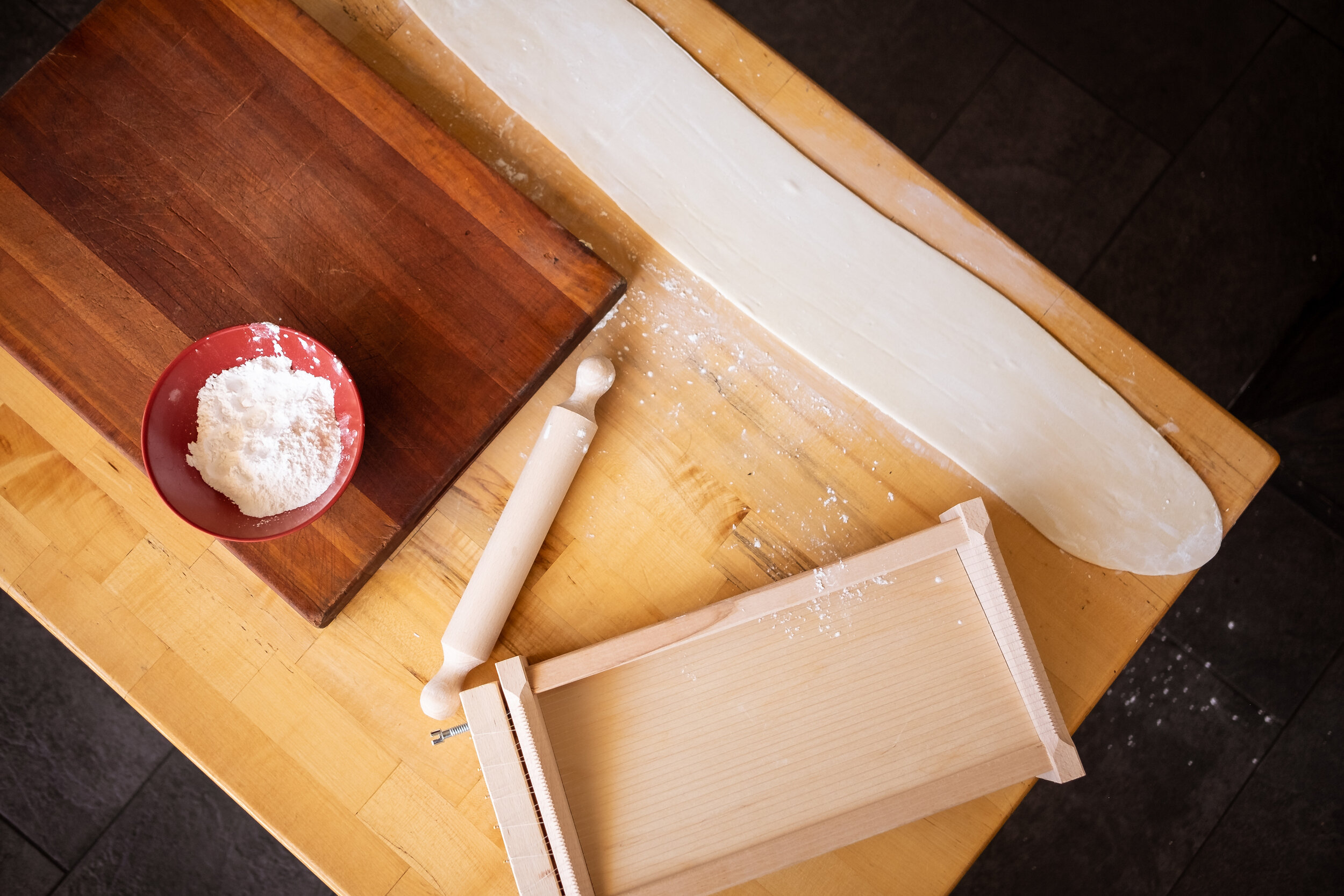
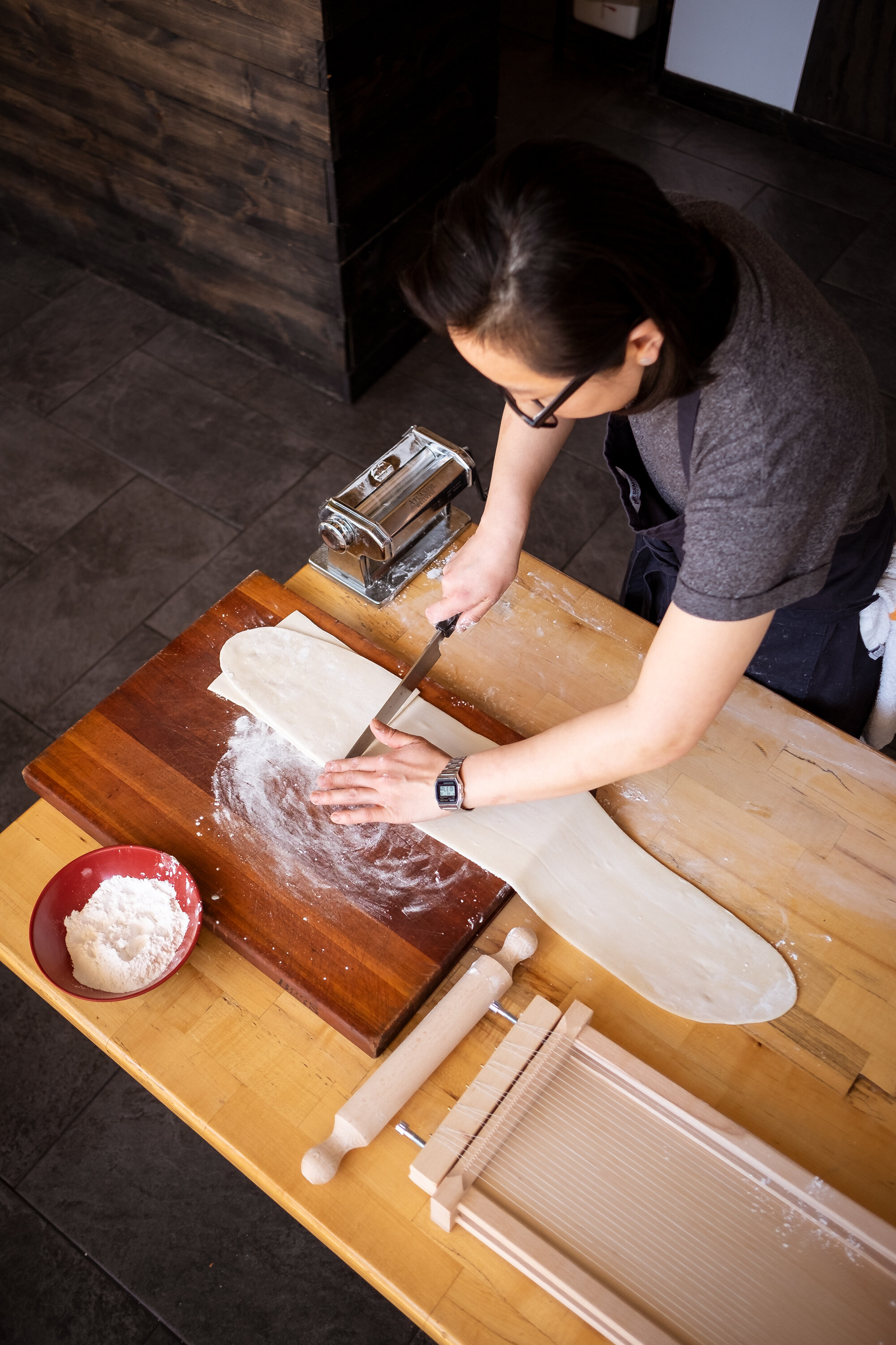
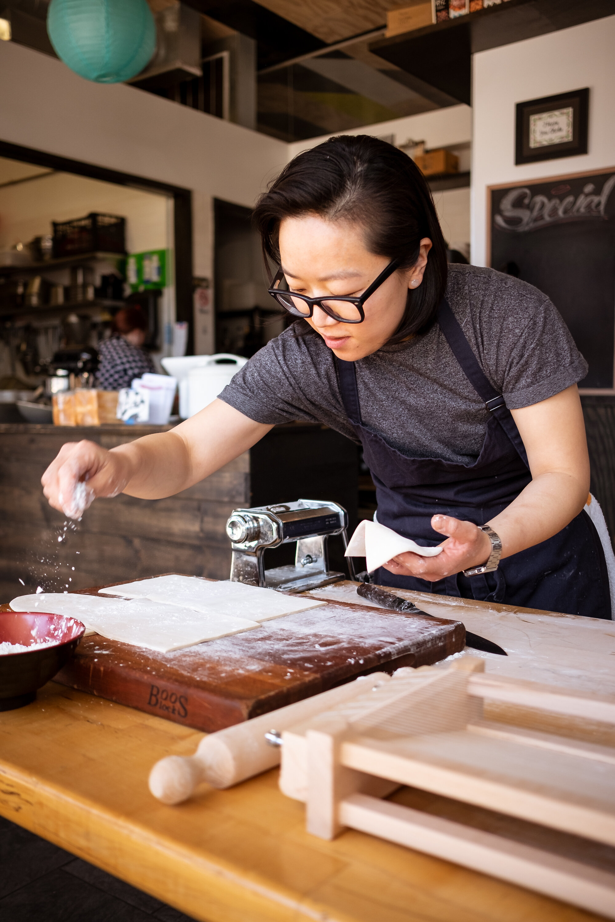
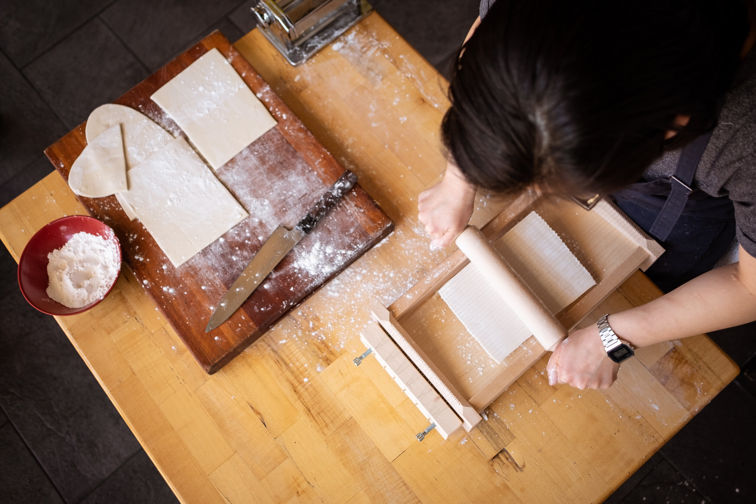
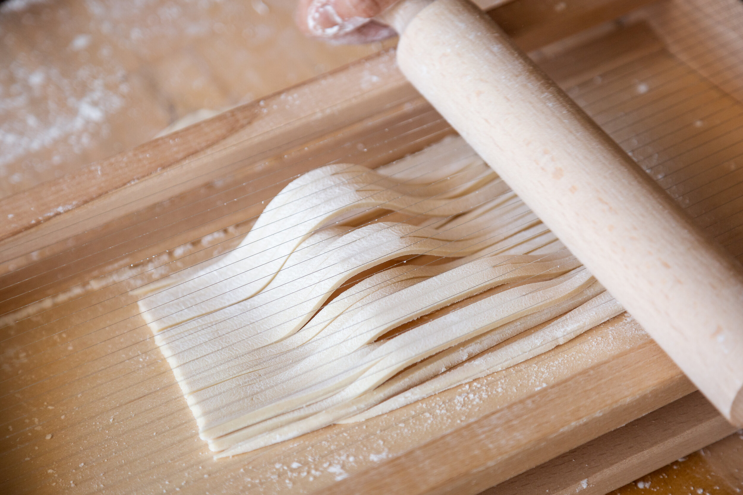
PHOTOGRAPHY
Photographer: Alec Ozawa
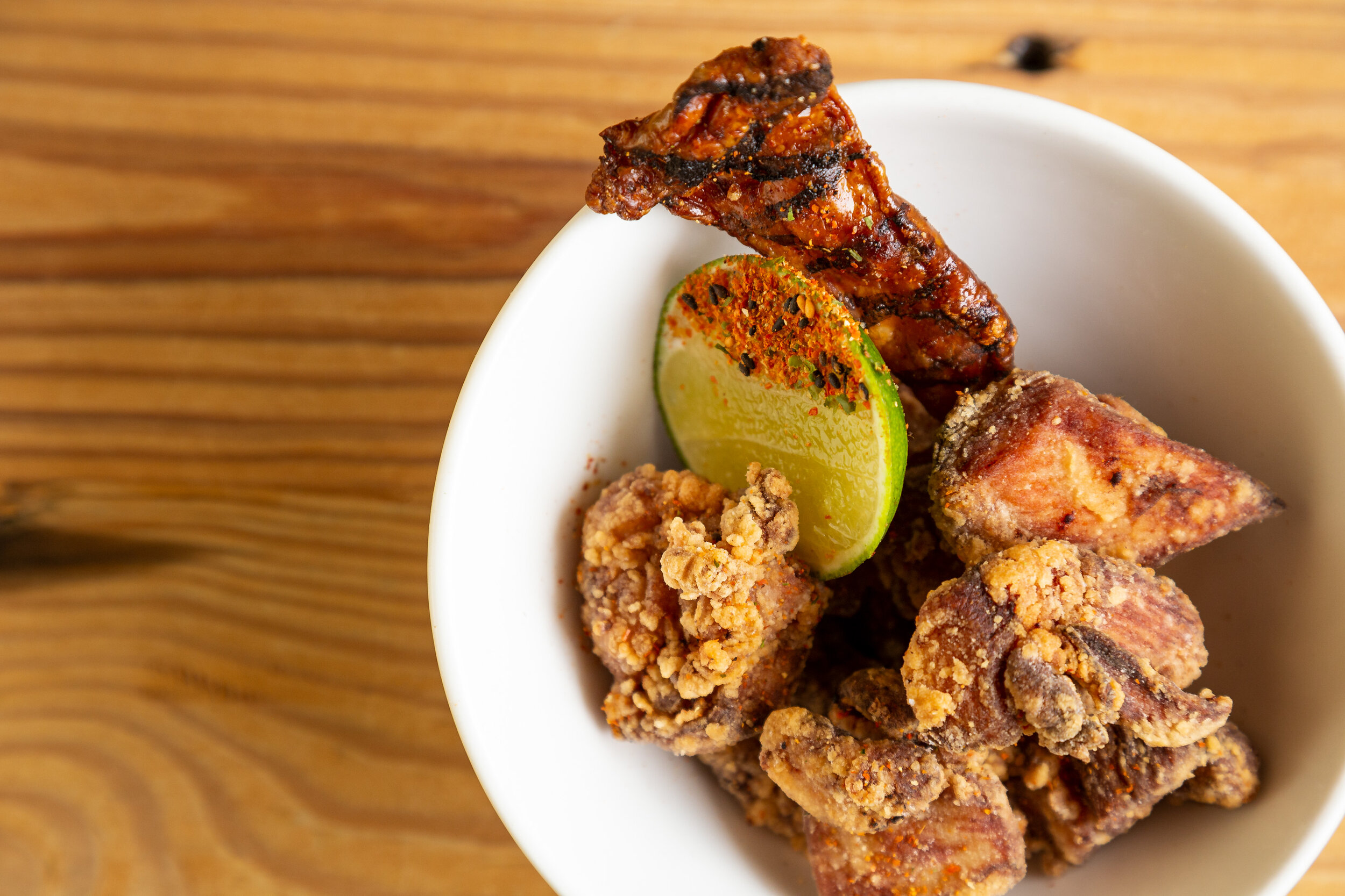
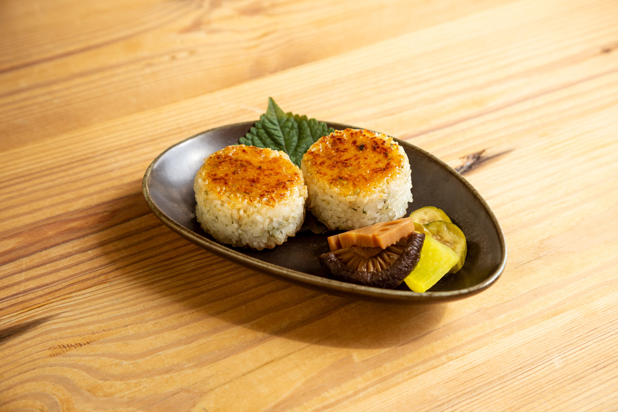
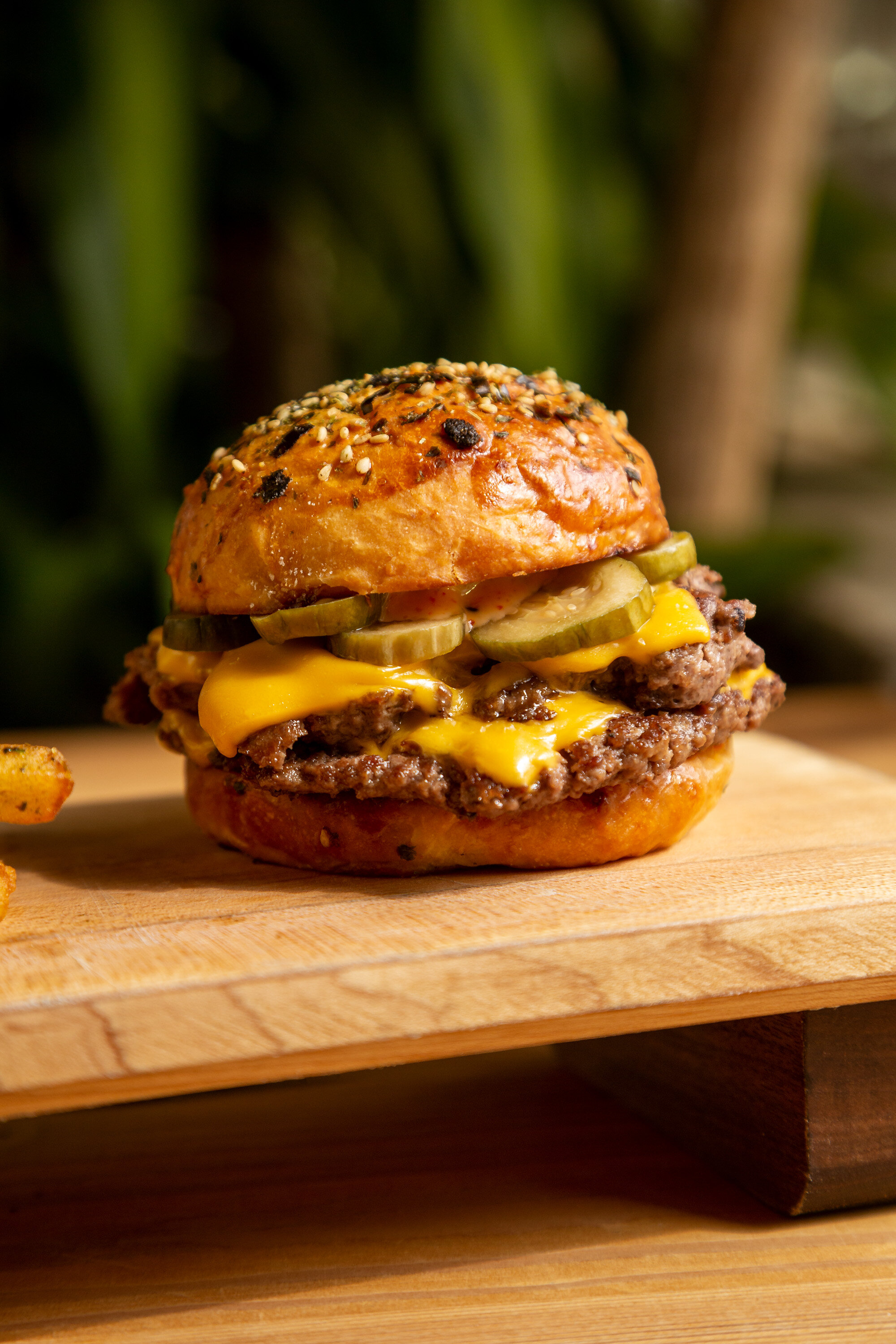
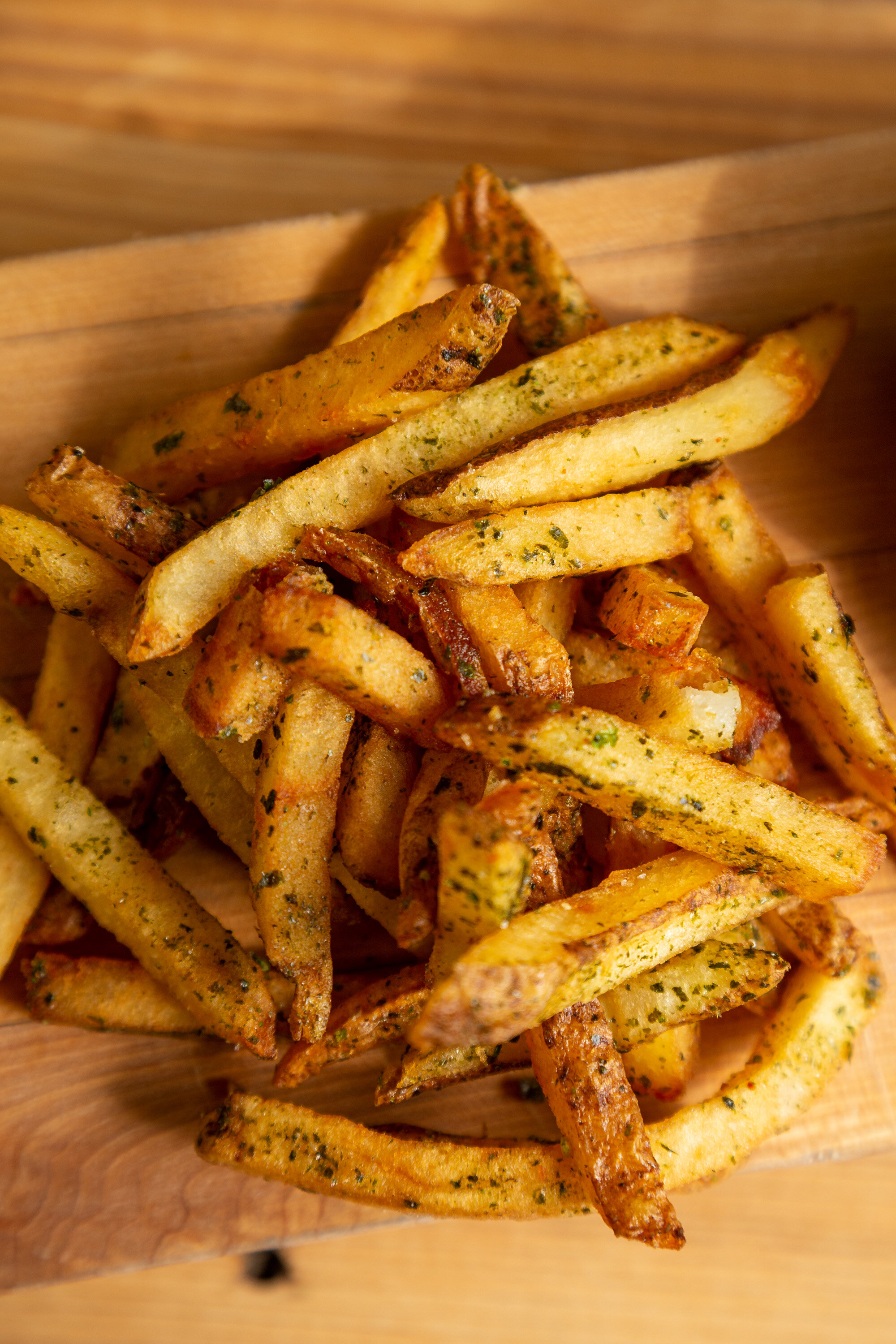
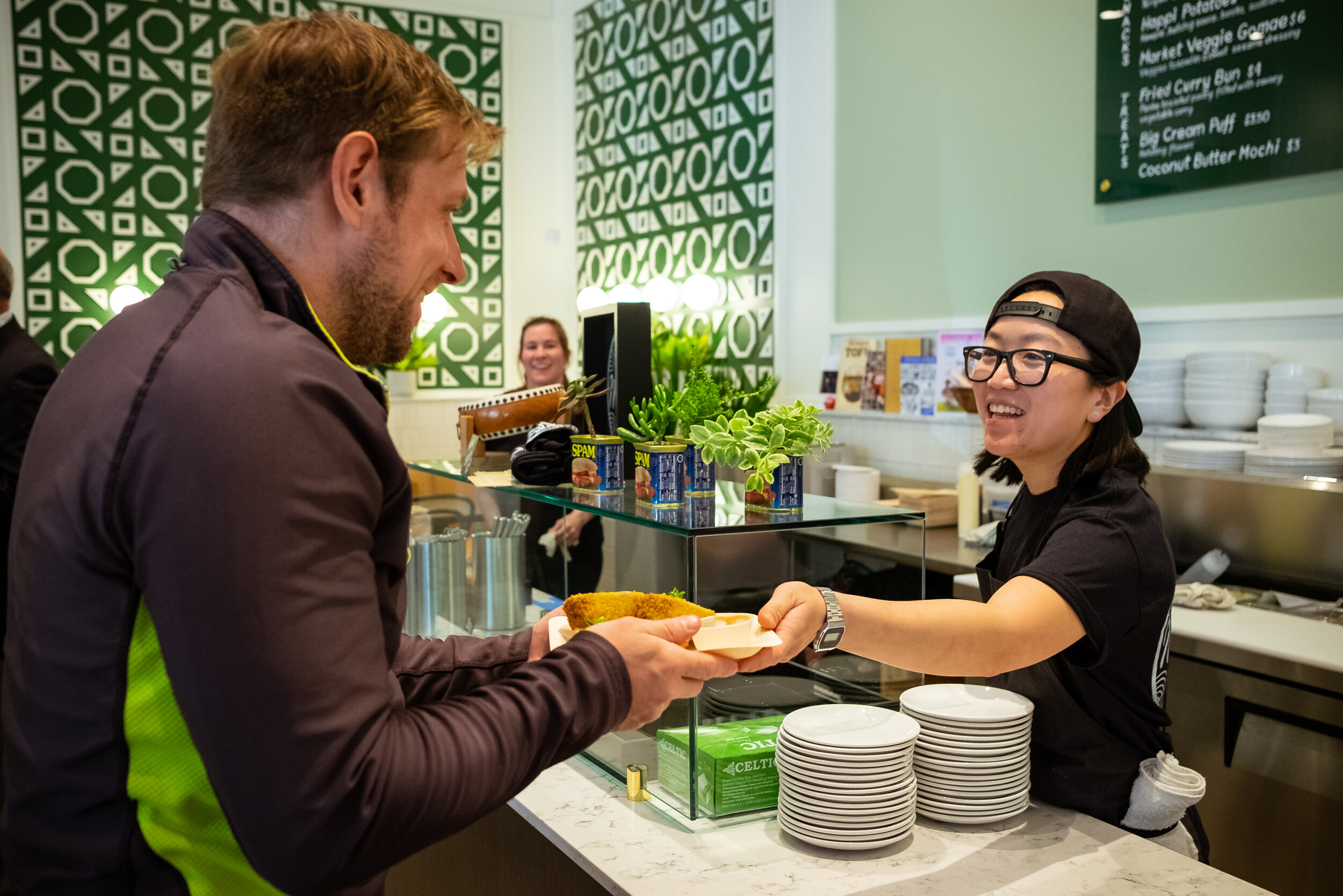
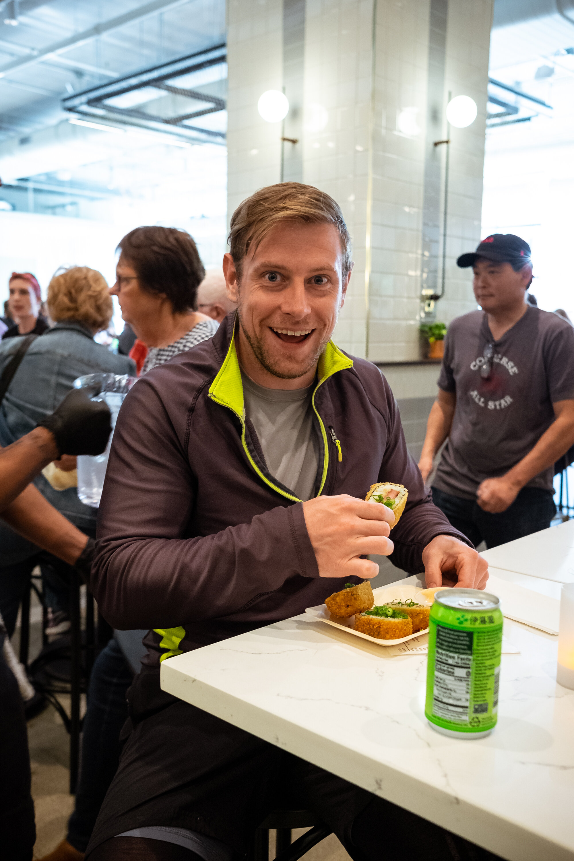
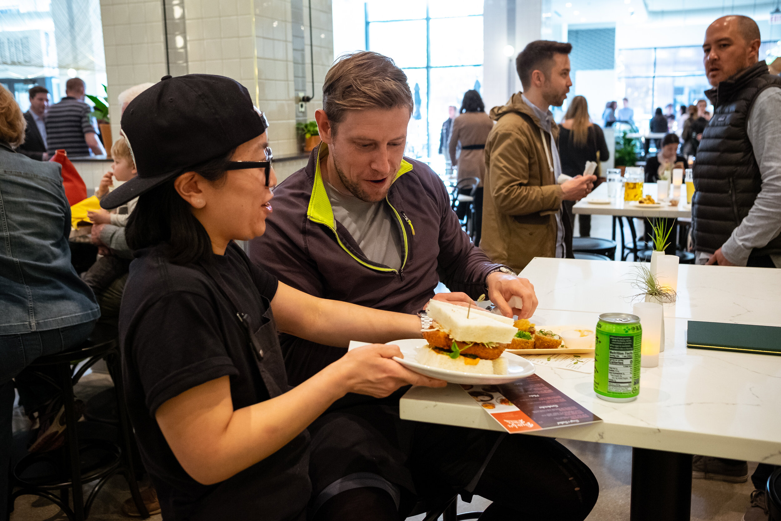
In preparation for the big launch of Mom’s brand, we needed original photography for various uses. We a spent two days of photography to showcase their menu items and personalities. These original photographs were used across press and social media to acquaint the public with the moms, and kick start your appetite.
Sample Press: CHICAGO EATER
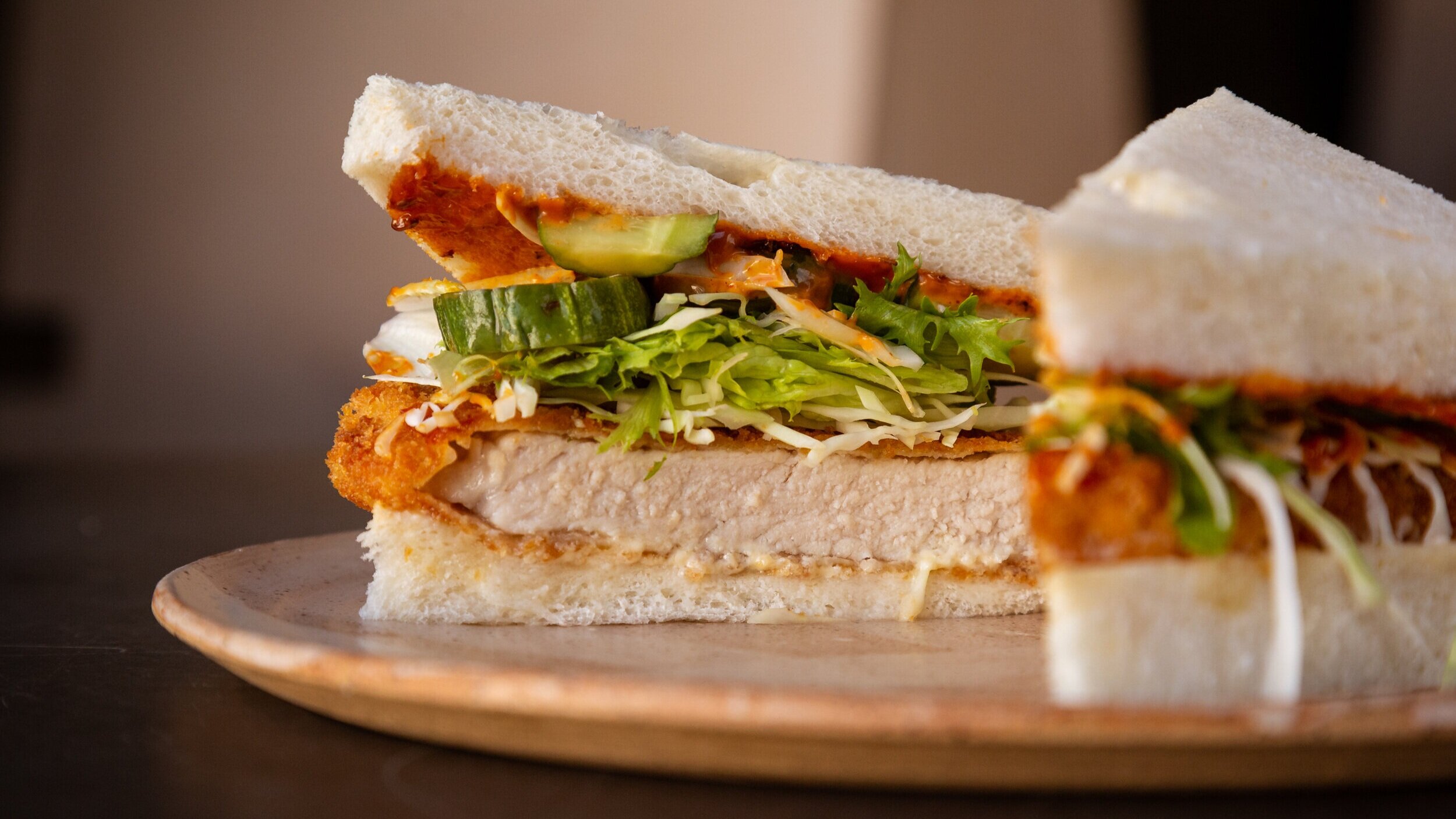

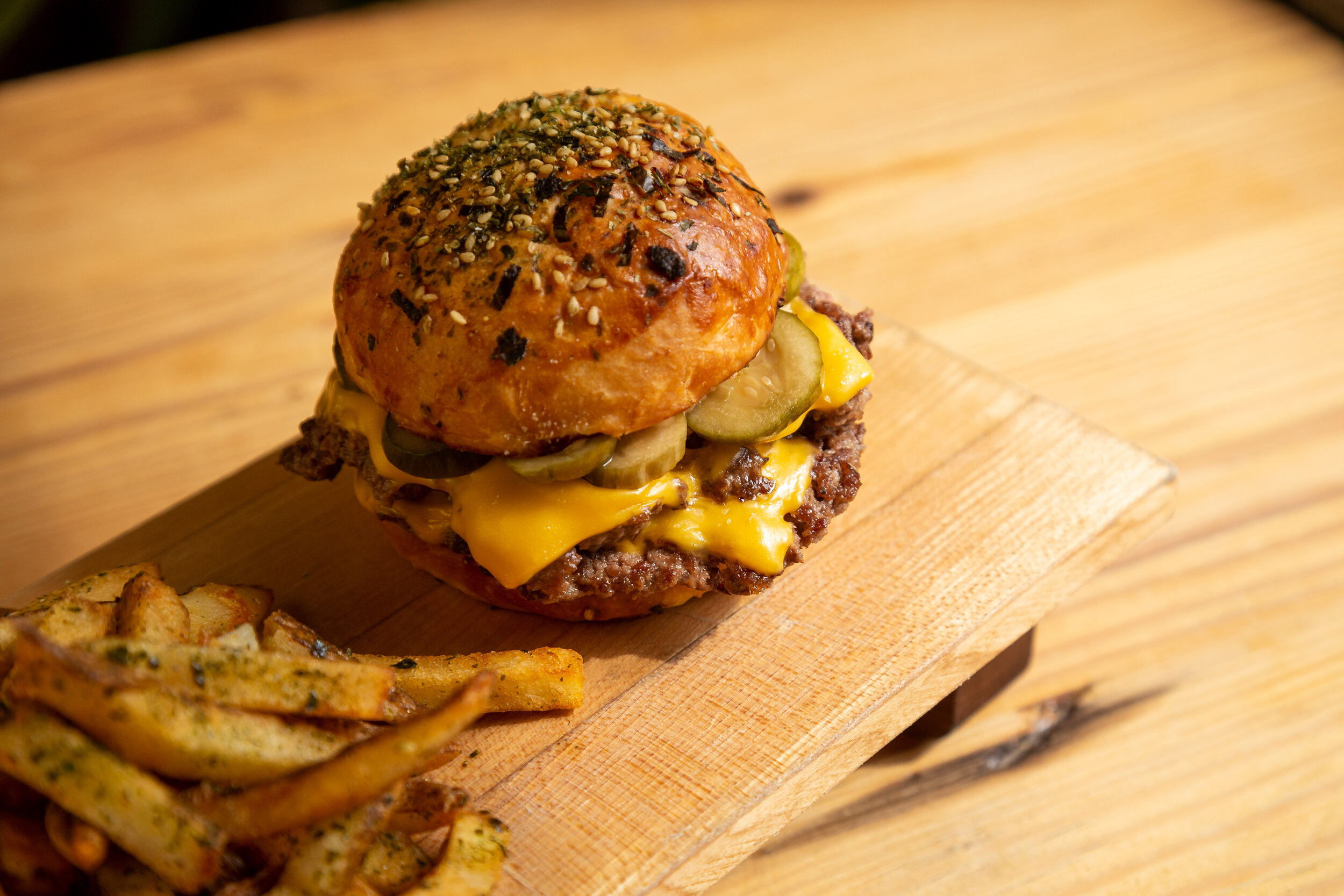
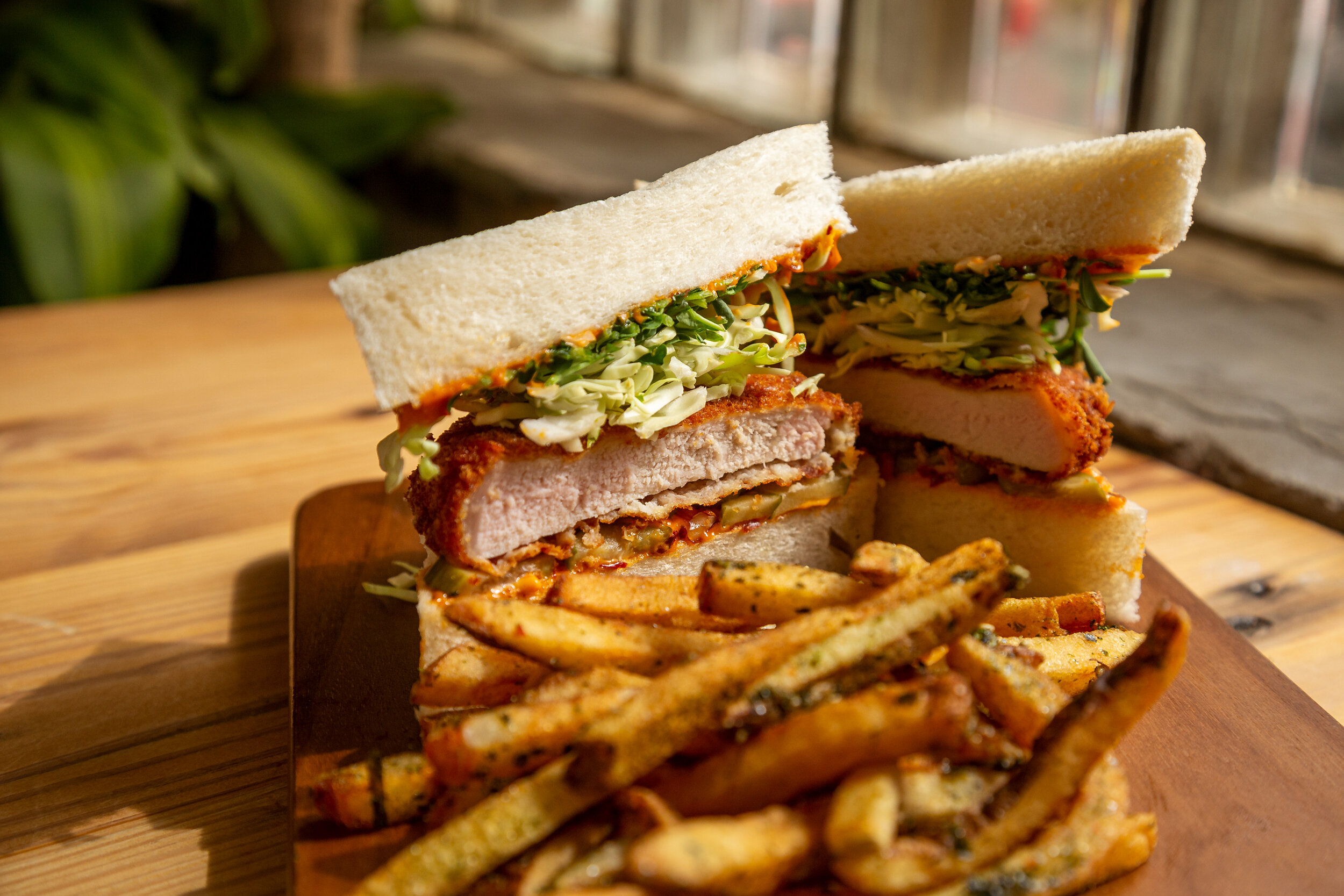
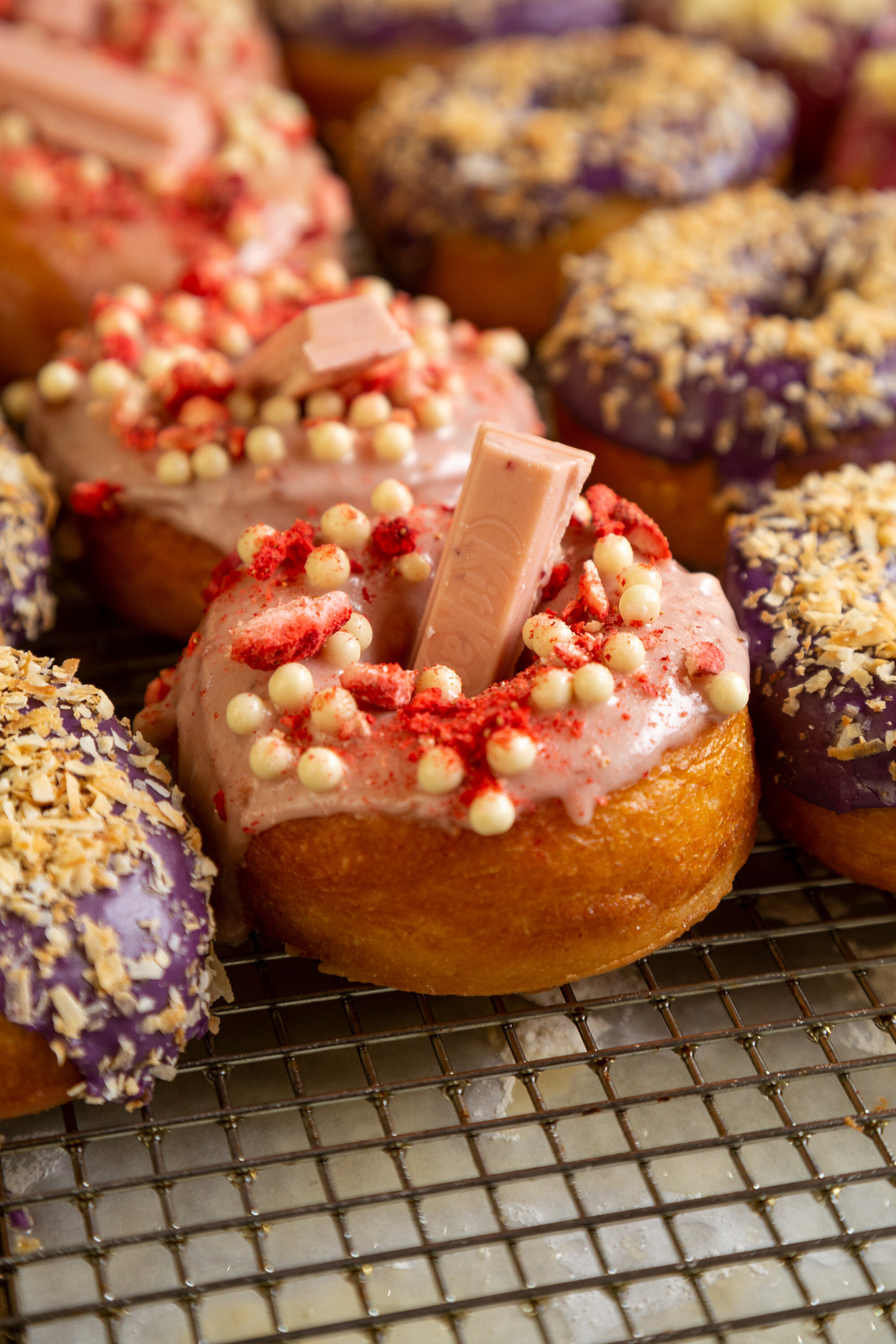
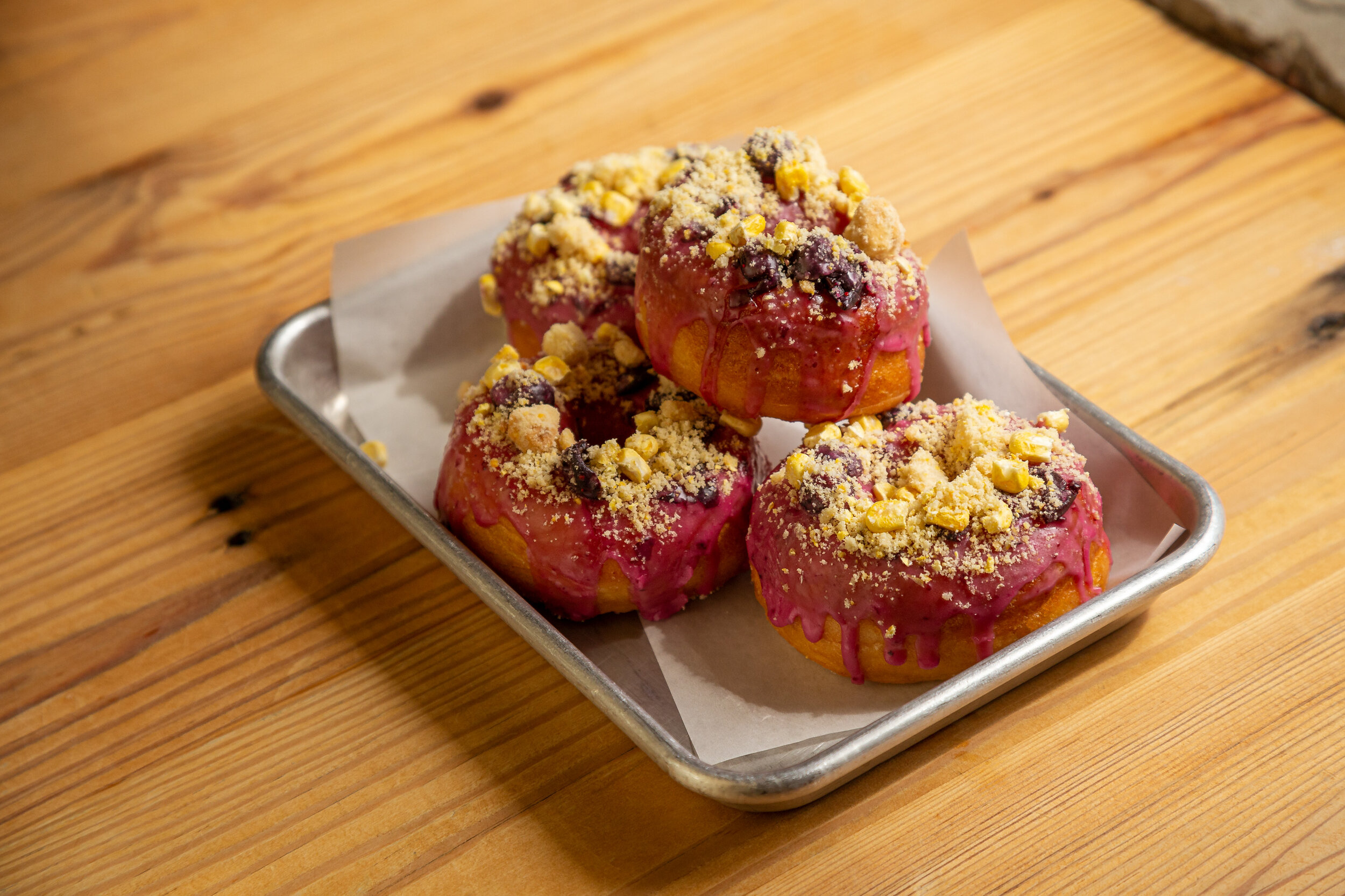


“SPRINGY, HANDMADE
UDON NOODLES, KATSU
SANDWICHES ON PILLOWY
MILK BREAD, AND UNIQUE,
INDULGENT PASTRIES ALL
MADE WITH LOVE, LIKE
MOM DOES.”
Social media launch

MERCH AND SWAG
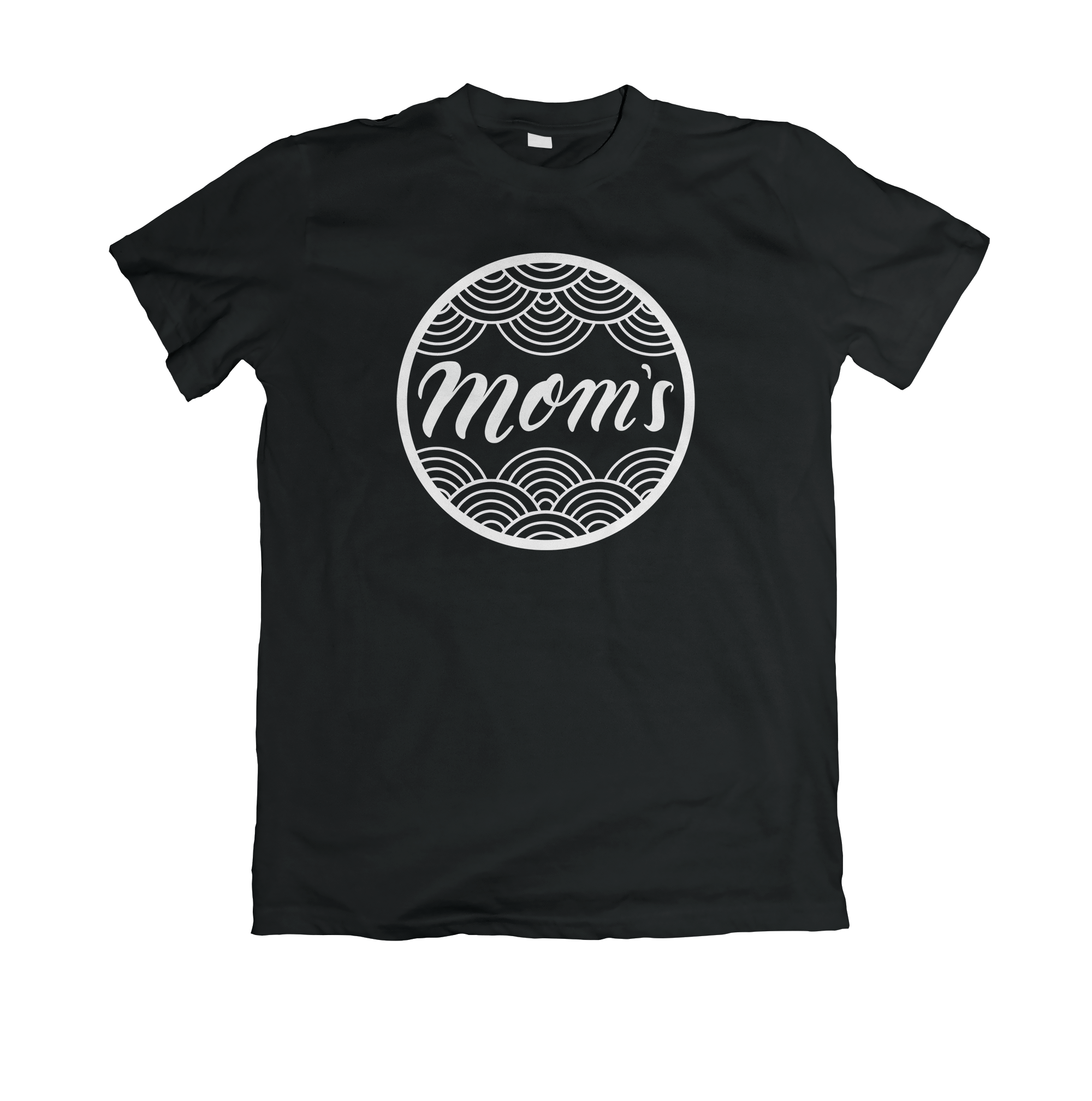
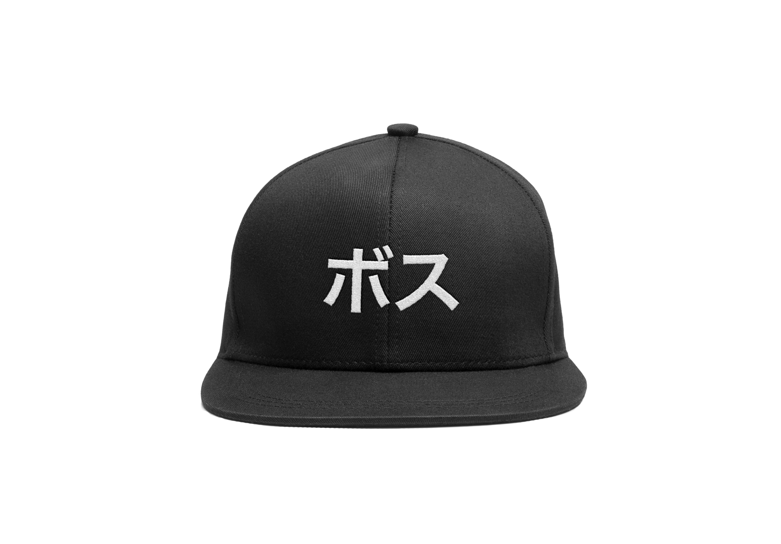
Various merch designed and produced for Mom’s Chicago. Mom’s shirts were screen printed in studio. The Hat reads “bosu” in Katakana, translating to “boss” in English. This is a reference to the Japanese feminist group, Sukeban, from the 70’s, which means “girl-boss”.


Fire Signs pro bono component to this project. Original designs and hand painted. 100% of sales at Mom’s go towards a charity of their choice.


From the genius of the Moms themselves: sustainable Spam succulent planters recycled from their Spam Musubis.
MOM’S FIRST
CUSTOMER!

COMPLEXCON CHICAGO
Mom’s was invited to ComplexCon in Chicago during the summer 2019 to feed the people.
We were excited to come in and provide the booth design, setup, and merch production, including: hand-painted jackets, skateboards, and screen printed apparel.

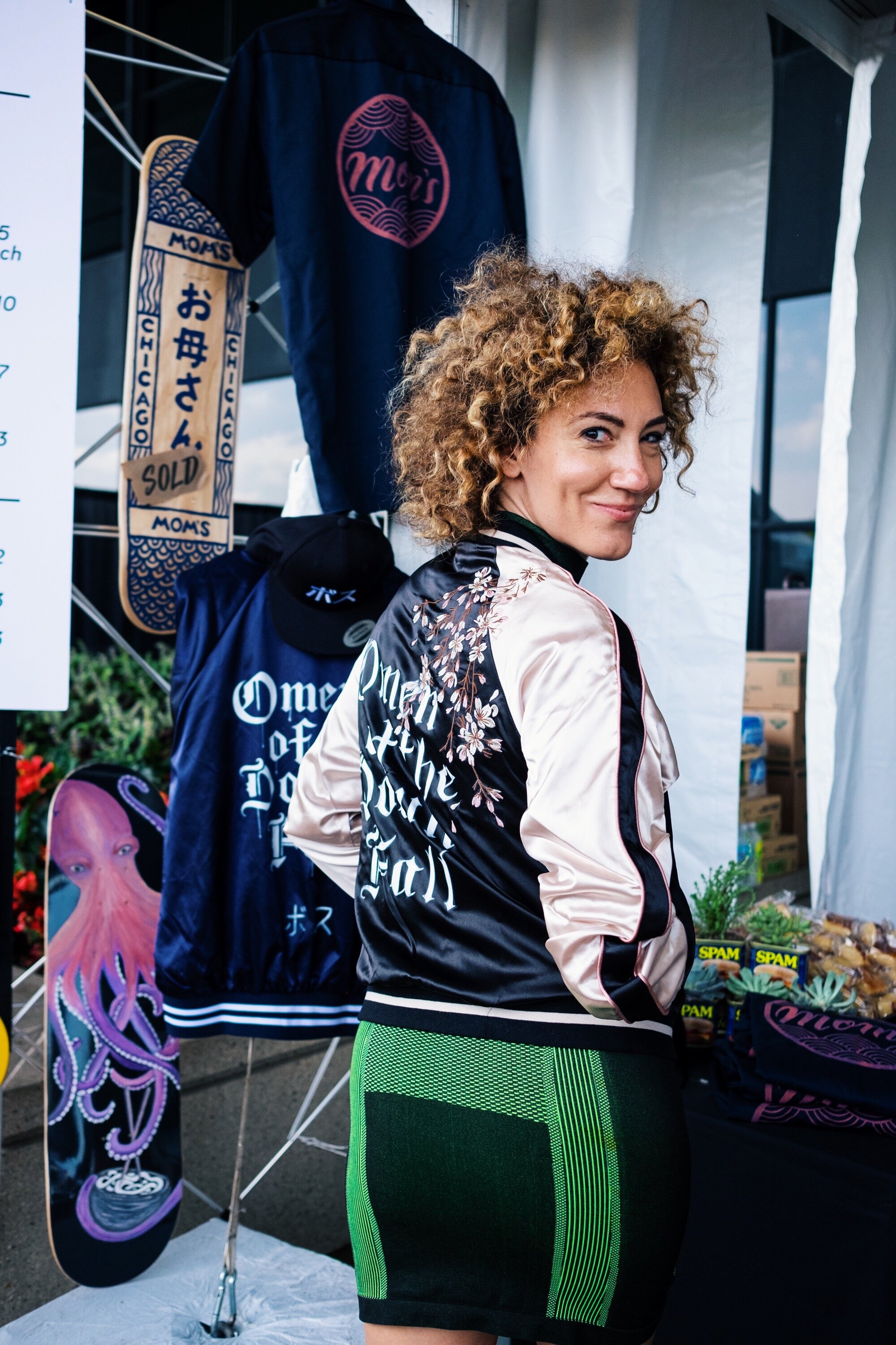
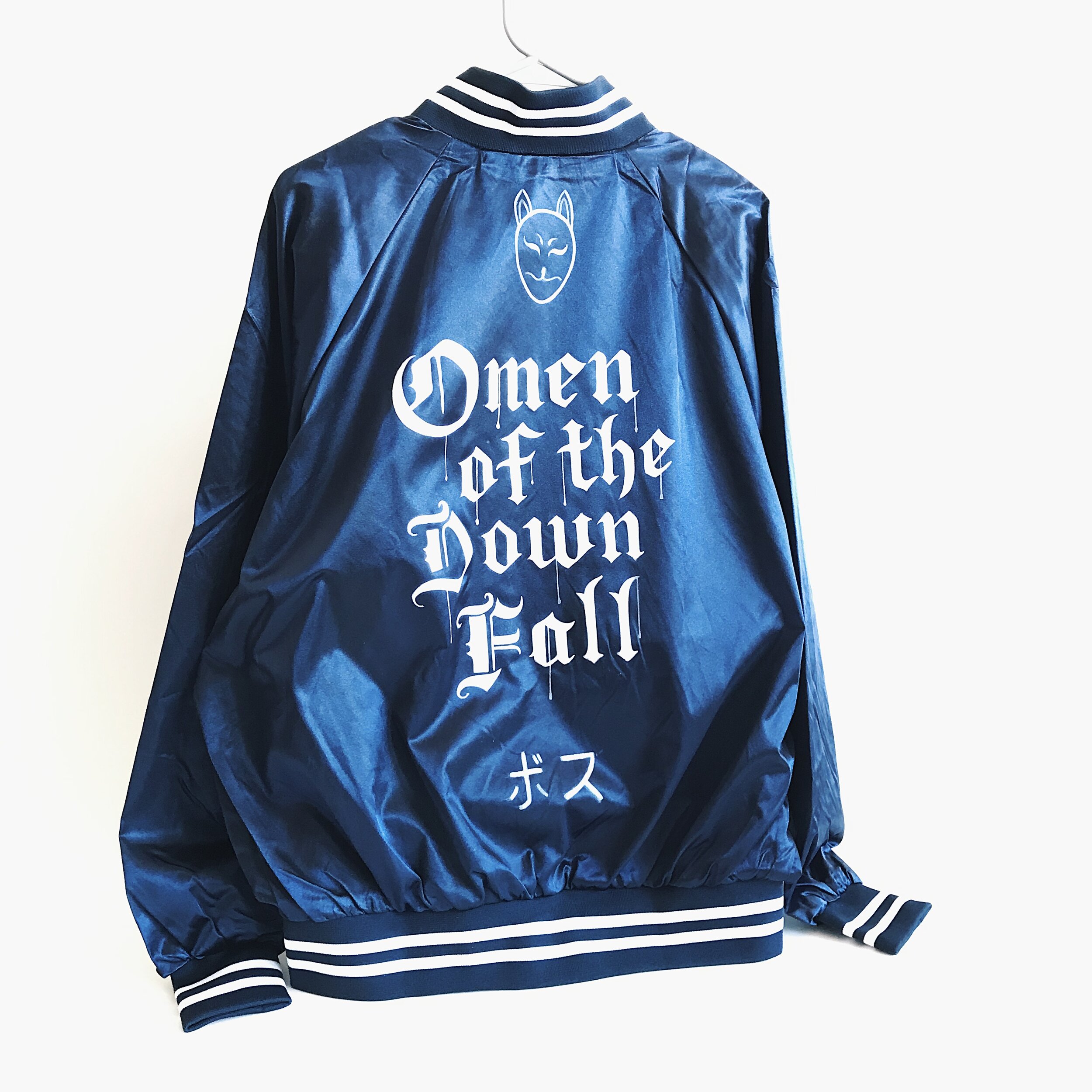
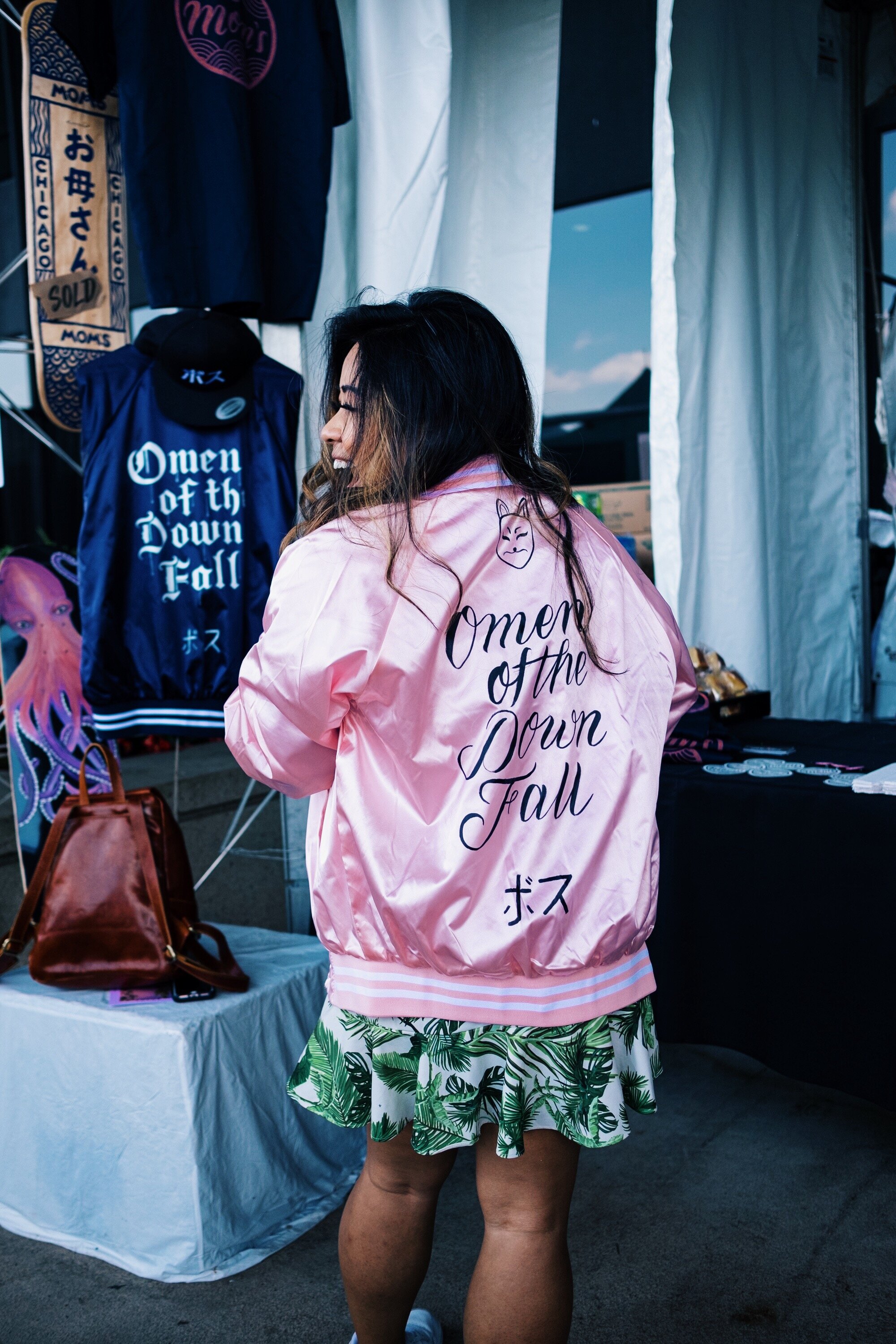
OMEN OF THE DOWNFALL - CUSTOMIZED HAND PAINTED JACKETS
Mom’s Chicago were asked to participate in ComplexCon 2019 as a vendor. As a marketing activation we created a line of hand painted sukejan jackets reading “omen of the downfall.” A term Japanese police used to refer to the Sukebans and the havoc that would ensue when they were around.