
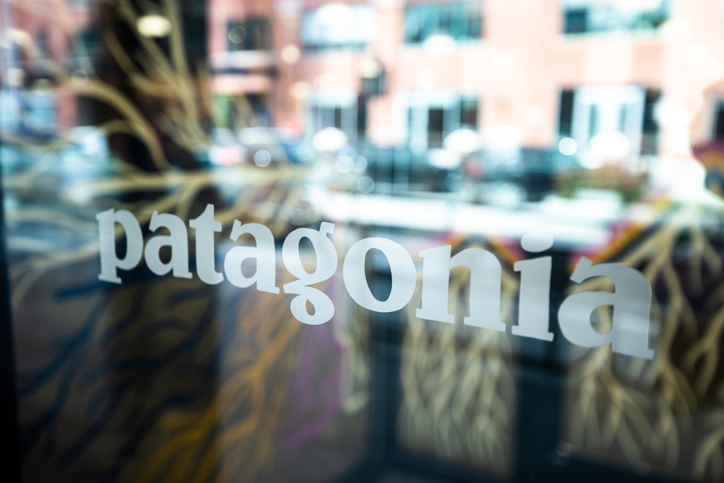
PATAGONIA CHICAGO
Case Study by Fire Signs LLC, Ashlee Stewack and Alec Ozawa
In summer of 2022, we began discussing the future opening of the Patagonia Chicago, Fulton Market location. This would be a brand new Patagonia store, and share space with the first ever Patagonia Worn Wear flagship store in the entire country. Fire Signs was enlisted to design and develop the hand painted signage and wayfinding (when appropriate) and paint the signage for both locations.
Here’s a look at the work we created for Patagonia.
CHALLENGE:
Create a cohesive story theme and concept to weave throughout the Patagonia Chicago’s store signage and visual identity.
DELIVERABLES:
Concept, theme and color story for hand painted signage
Vestibule Artwork
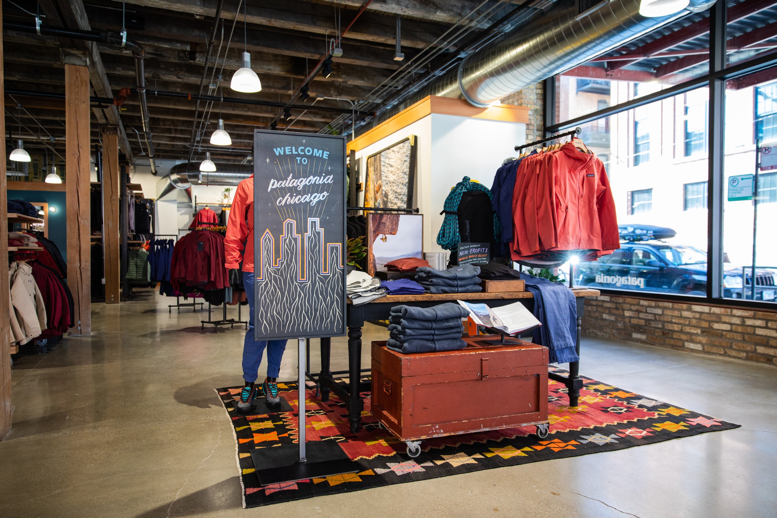
Standing sign artwork
Column design development
Bathroom and way finding signage
All hand painted signage
CONCEPT:
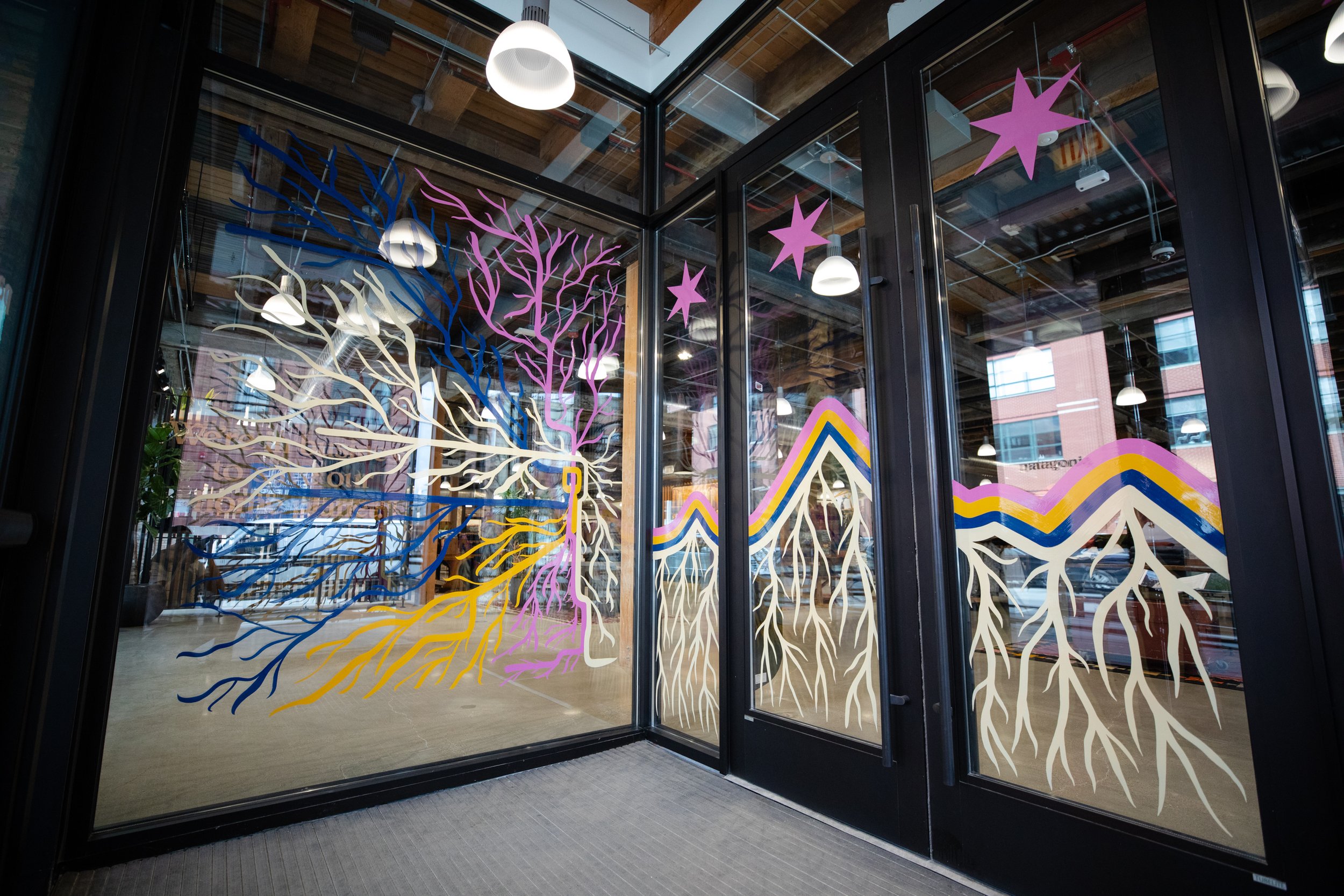
When we discovered that the intention for the Patagonia Chicago store was a focus on environmental activism and the work of Chicago’s communities, we knew the theme had to be one of inter-connectedness. Leaning into this intention, we chose a “GRASSROOTS” theme, to play on the connection to both the earth beneath our feet, as well as the organizing movement that emerges in local communities centered on climate activism.
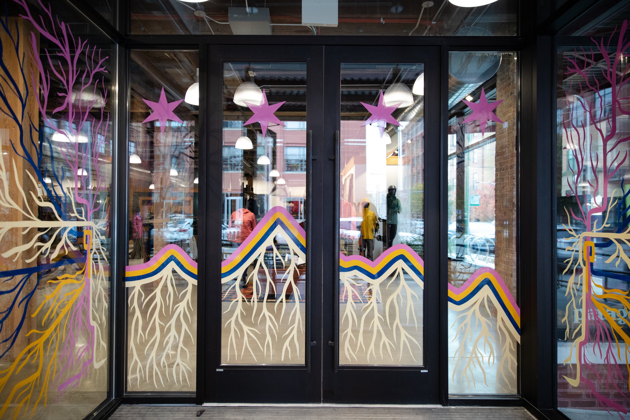
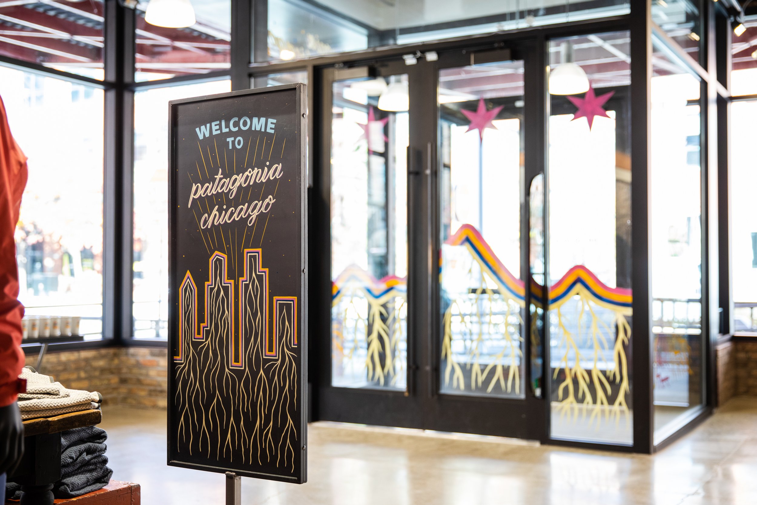
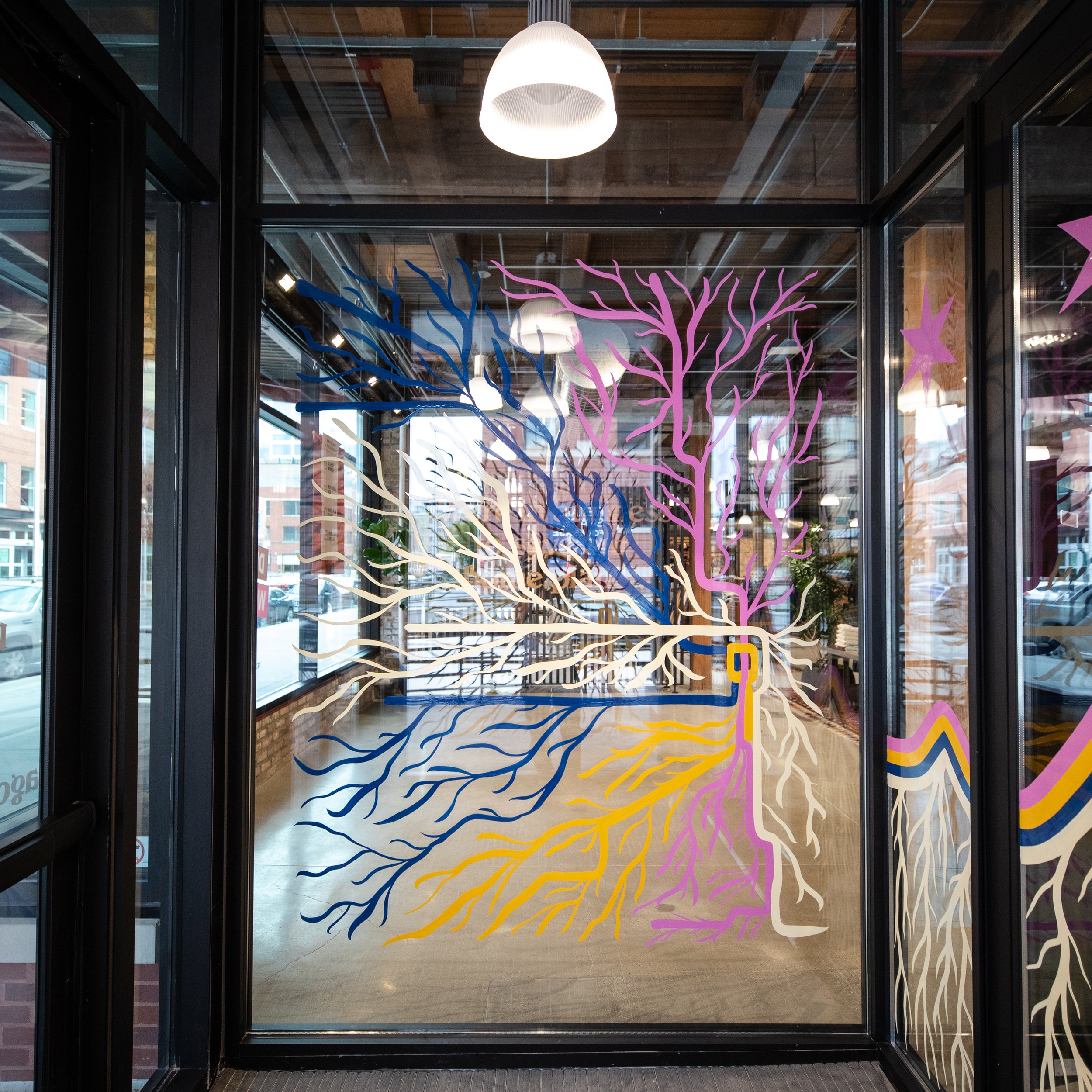
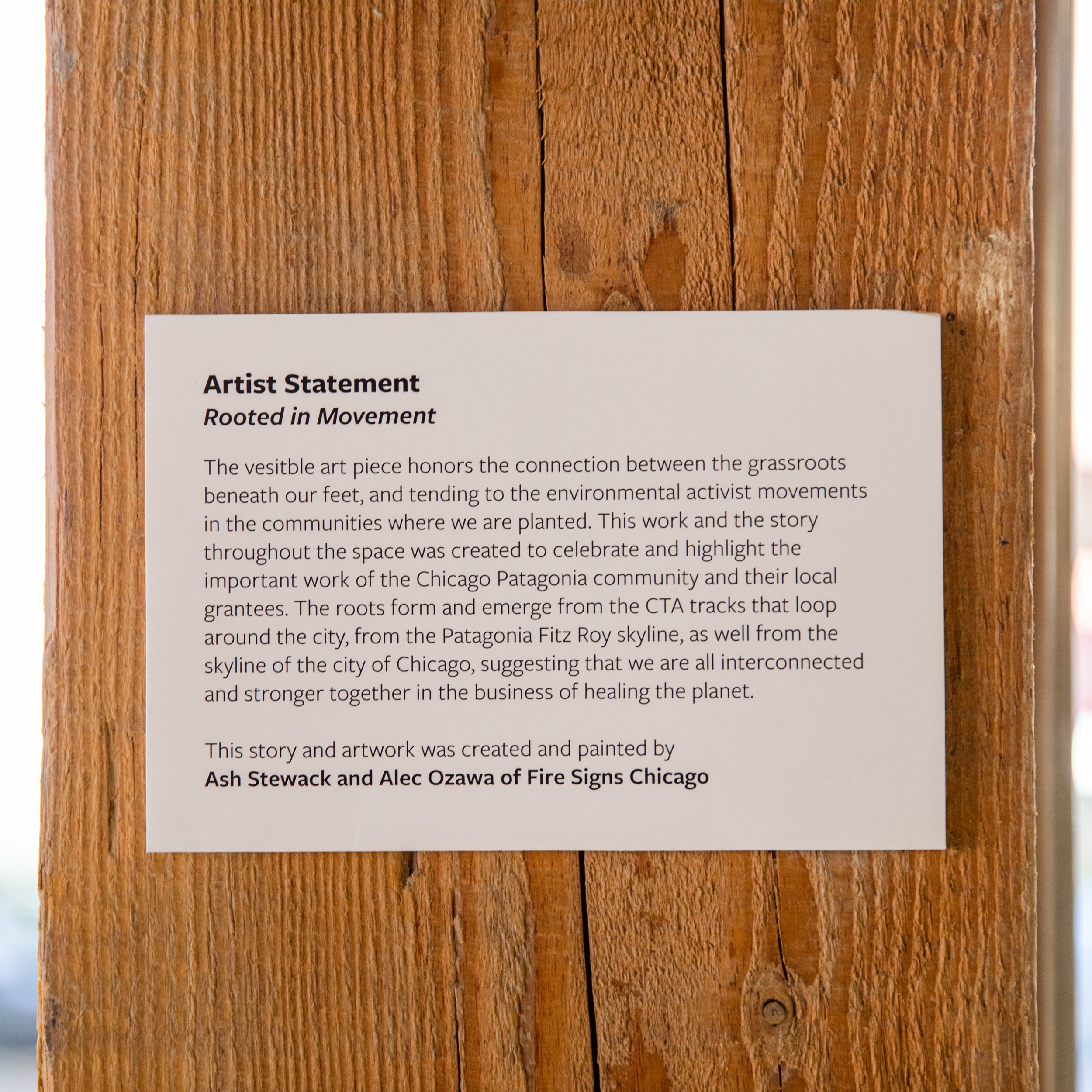
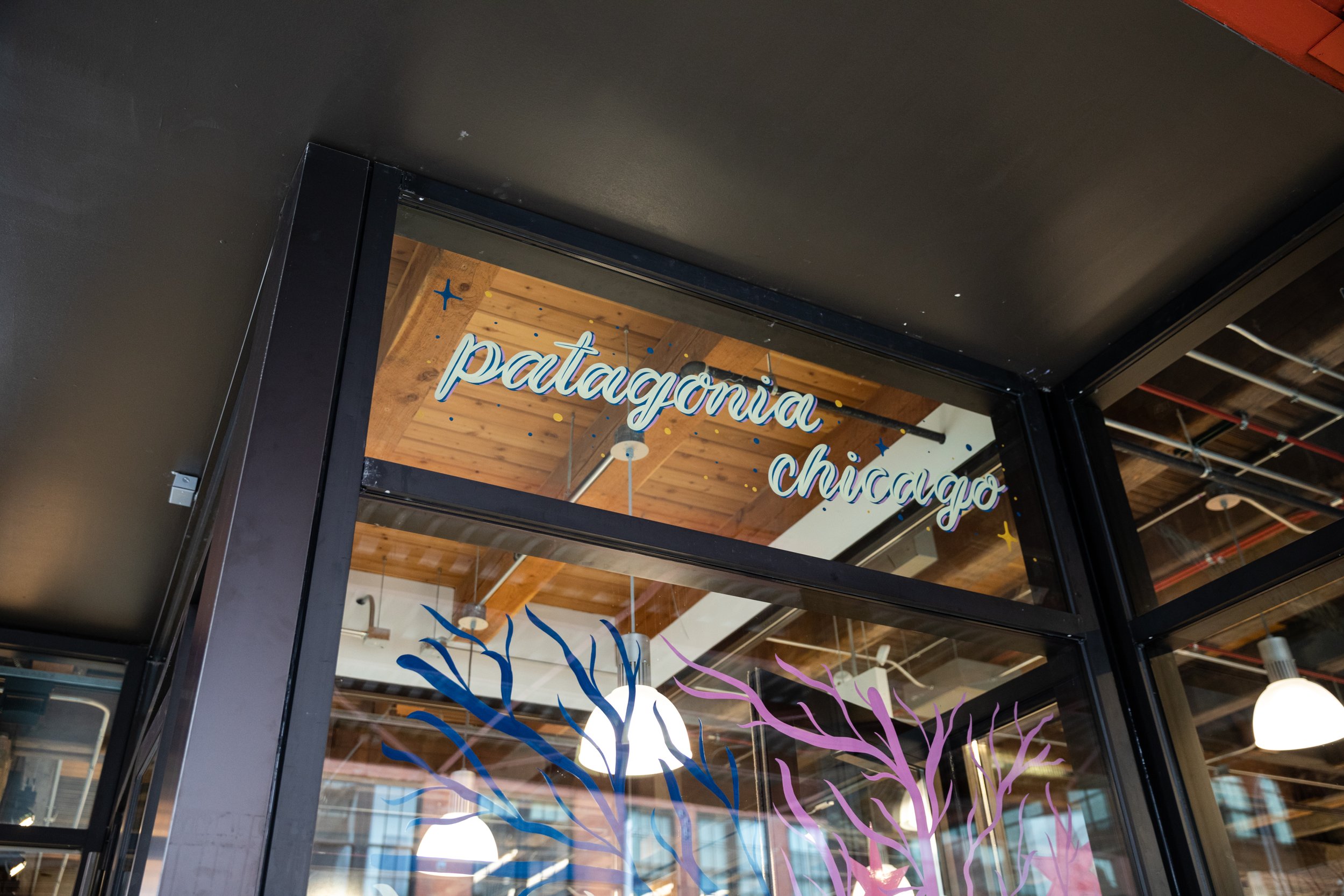
VESTIBULE AND STORE CONCEPT ARTIST STATEMENT
Title: Rooted in Movement
This piece honors the connection between the grassroots beneath our feet and tending to the environmental activism movements in the communities where we are planted. This work and the story throughout the space was created to celebrate and highlight the important work of the Chicago Patagonia community and their local grantees. The roots form and emerge from the CTA tracks that loop around the city, from the Patagonia Fitz Roy skyline, as well from the skyline of the city of Chicago, suggesting that we are all interconnected and stronger together in the business of healing the planet.
This story and artwork was created and painted by Ash Stewack and Alec Ozawa of Fire Signs Chicago.
We thought it would be interesting to use evergreen symbols, such as the Patagonia Fitzroy skyline, the Chicago skyline and the Chicago CTA map to illustrate the concept of interconnectedness. With a love of nature and their living systems, this reminded us how the roots of trees create a blanket network of connection.
The CTA map supports this, as well as brings home the energy of “movement”, suggesting that our coming and goings can emerge as always connected. Of course, the four Chicago flag stars just above the skyline, as a guiding force to the roots and their movements.
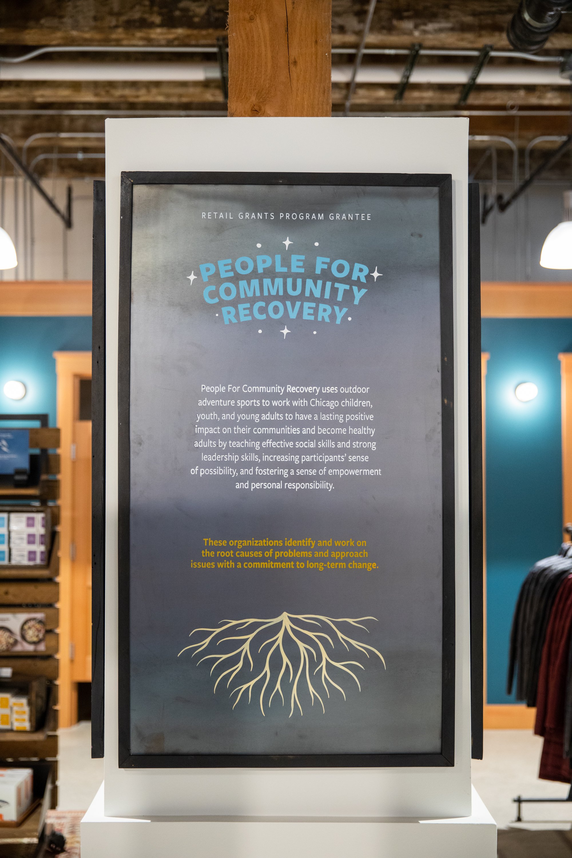
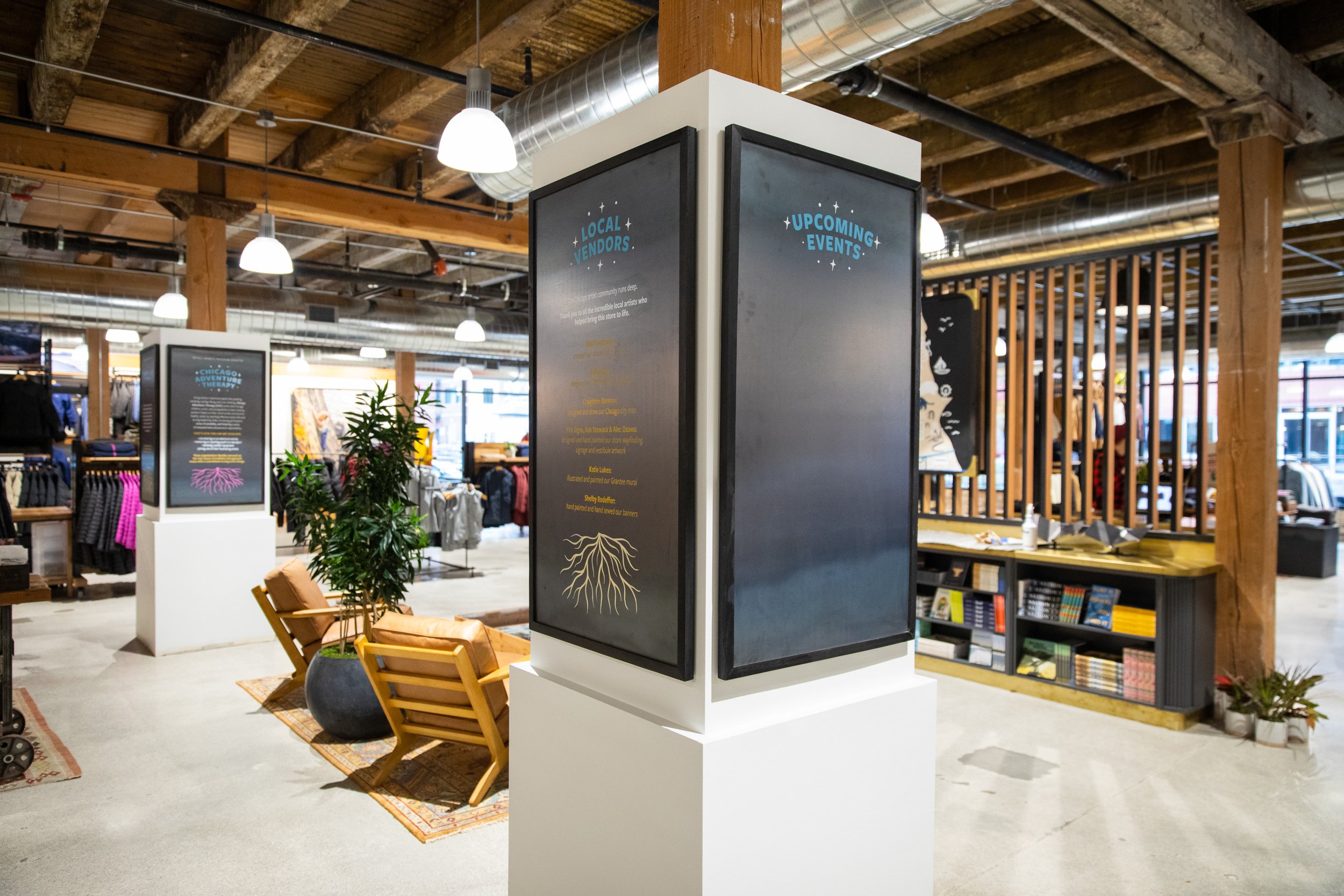
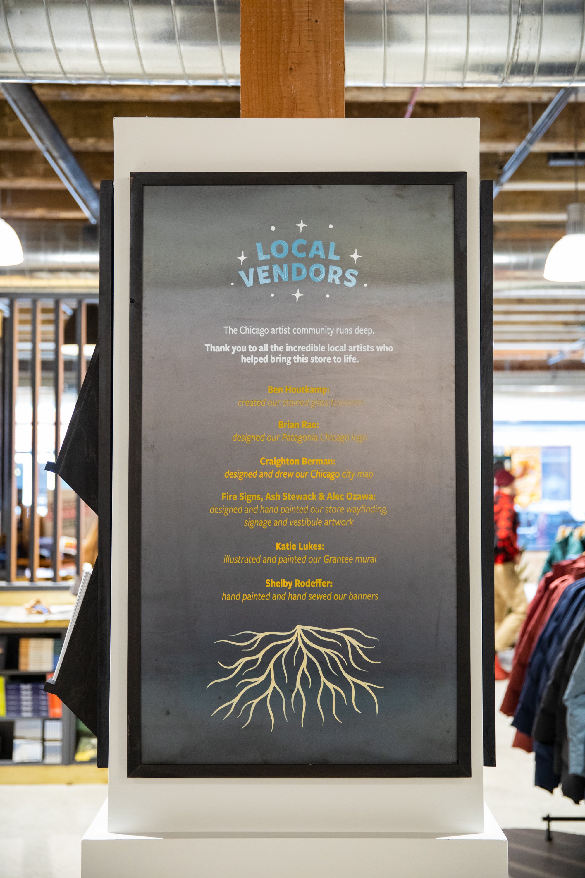
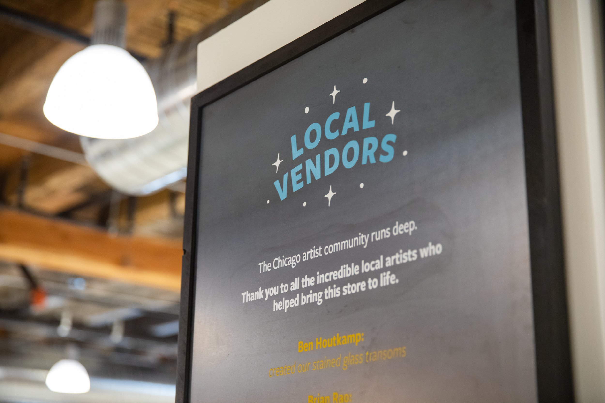
central COLUMNS
InTENTION:
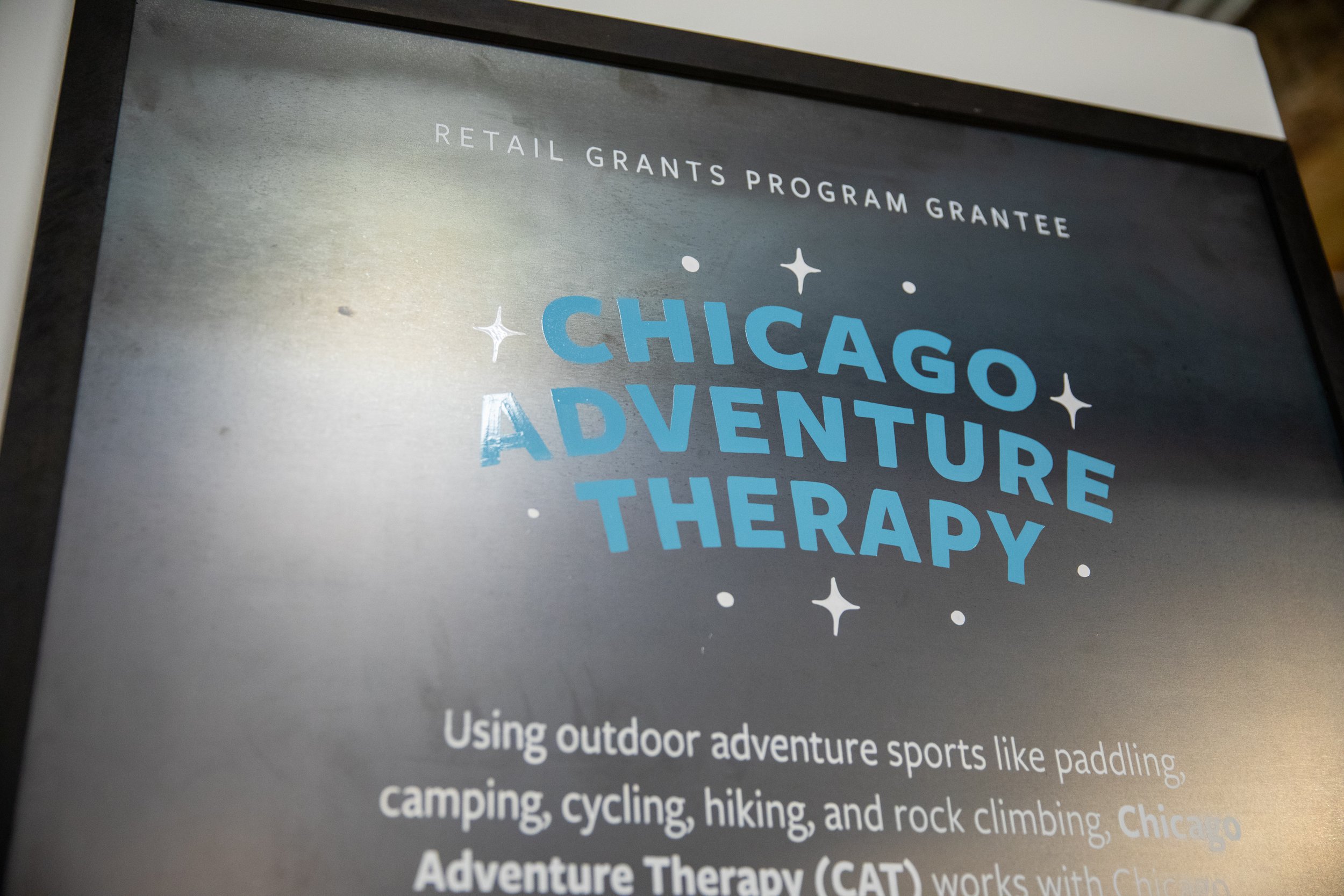
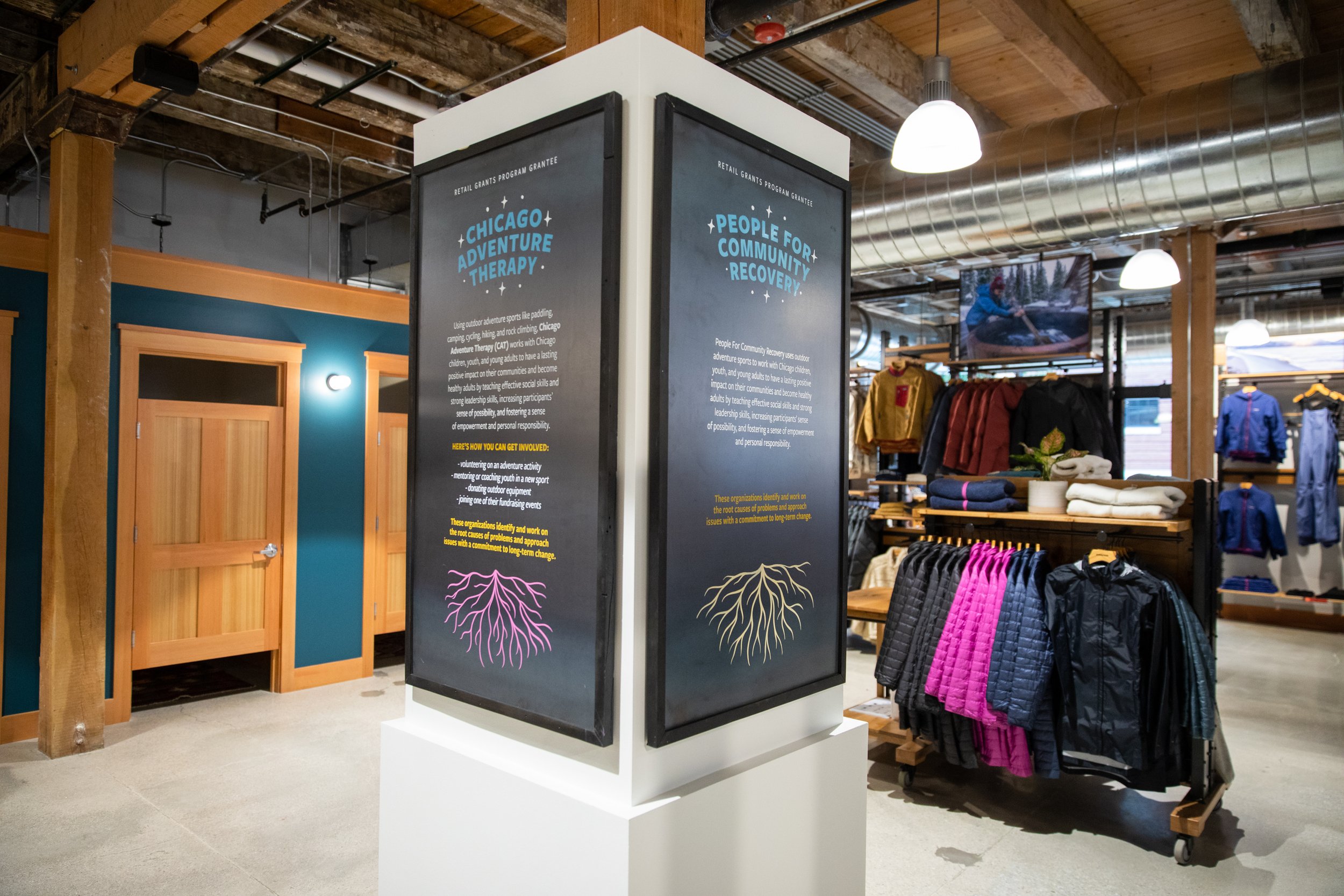
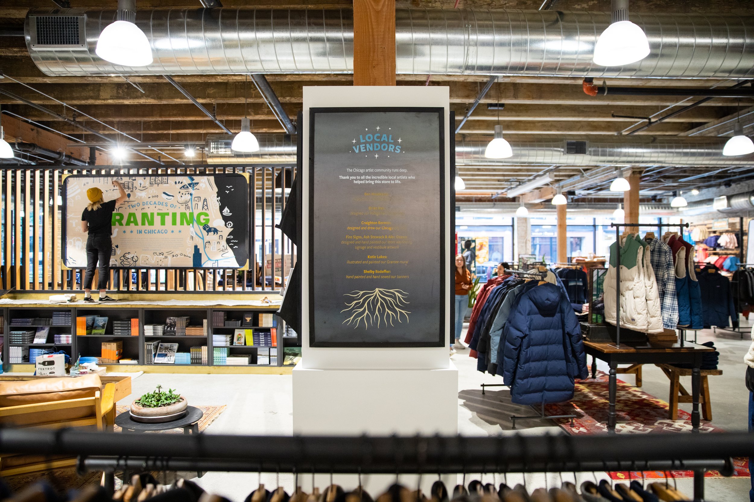
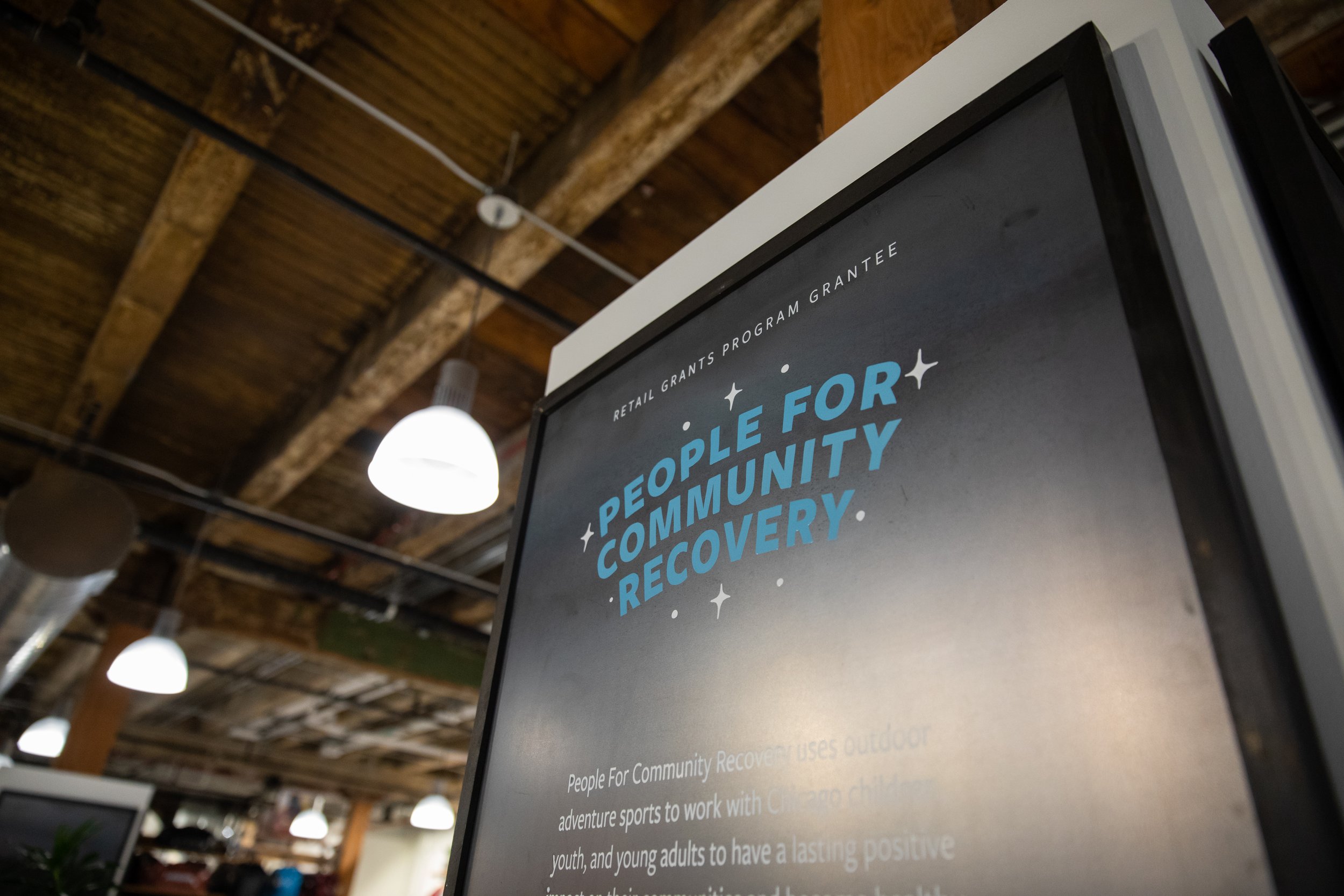
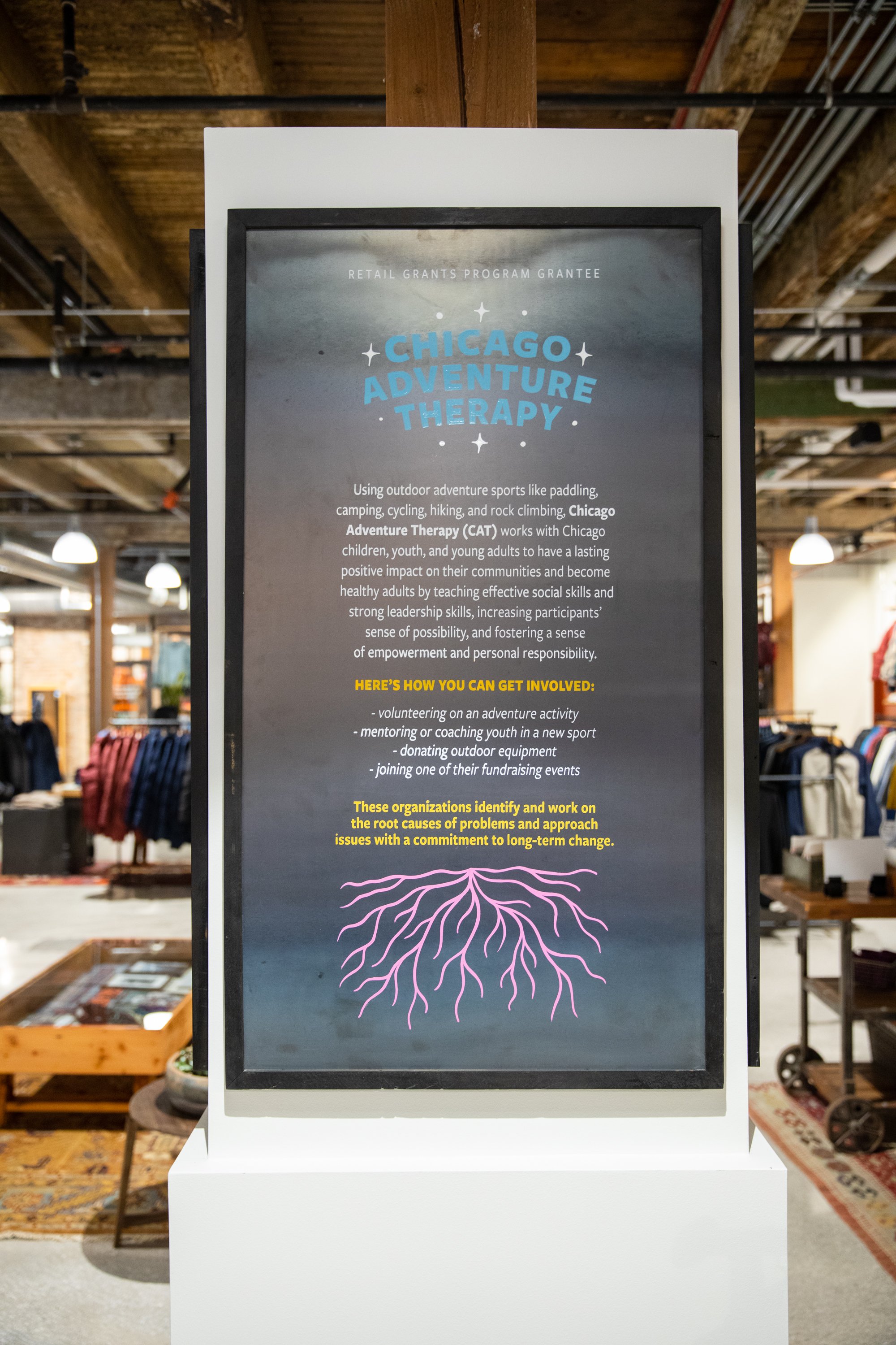
The primary intention was to create the column designs in the central community hub of the store, that are connected and interwoven with the artwork and ancillary signage of the store. This area was made to celebrate the Chicago grantee’s of the Patagonia Retail Grantee Program, as well as the local Chicago community. Serving as a place to learn about the environmental work happening in the city, or pay tribute to the local artists that helped bring the space to life.
PROCESS:
As these columns hosting much more text and body copy information, we decided to open up our process to consider alternative ways to paint the smaller letter forms. Pulling in the grassroots and hand lettered style, we took a hand-painted approach for the root and star illustrations and headers, and screen-printed the body copy. This allowed the work to have a more informative and modern aesthetic, while not compromising on the hand painted feel of our work.
ADDITIONAL LETTERING


We hand-lettered and painted a total of six doors throughout the space. Four All Gender Restrooms and two Employee’s Only doors.

To tie it together, we added an “Hours” hand lettered and painted header to the front door vestibule to establish a sense of transit.
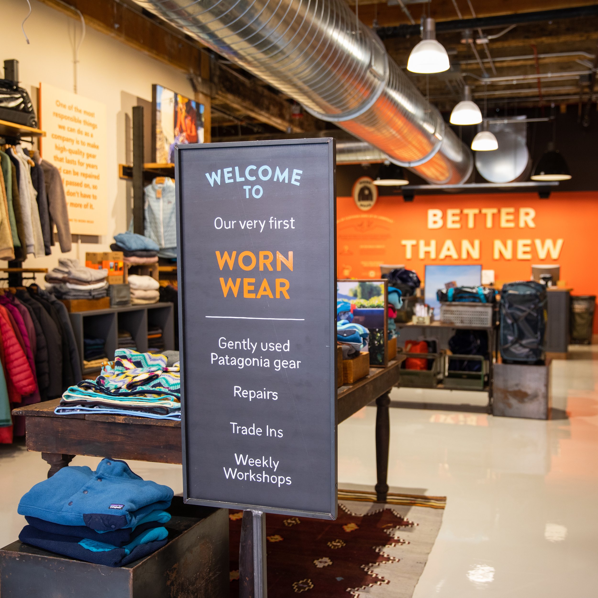
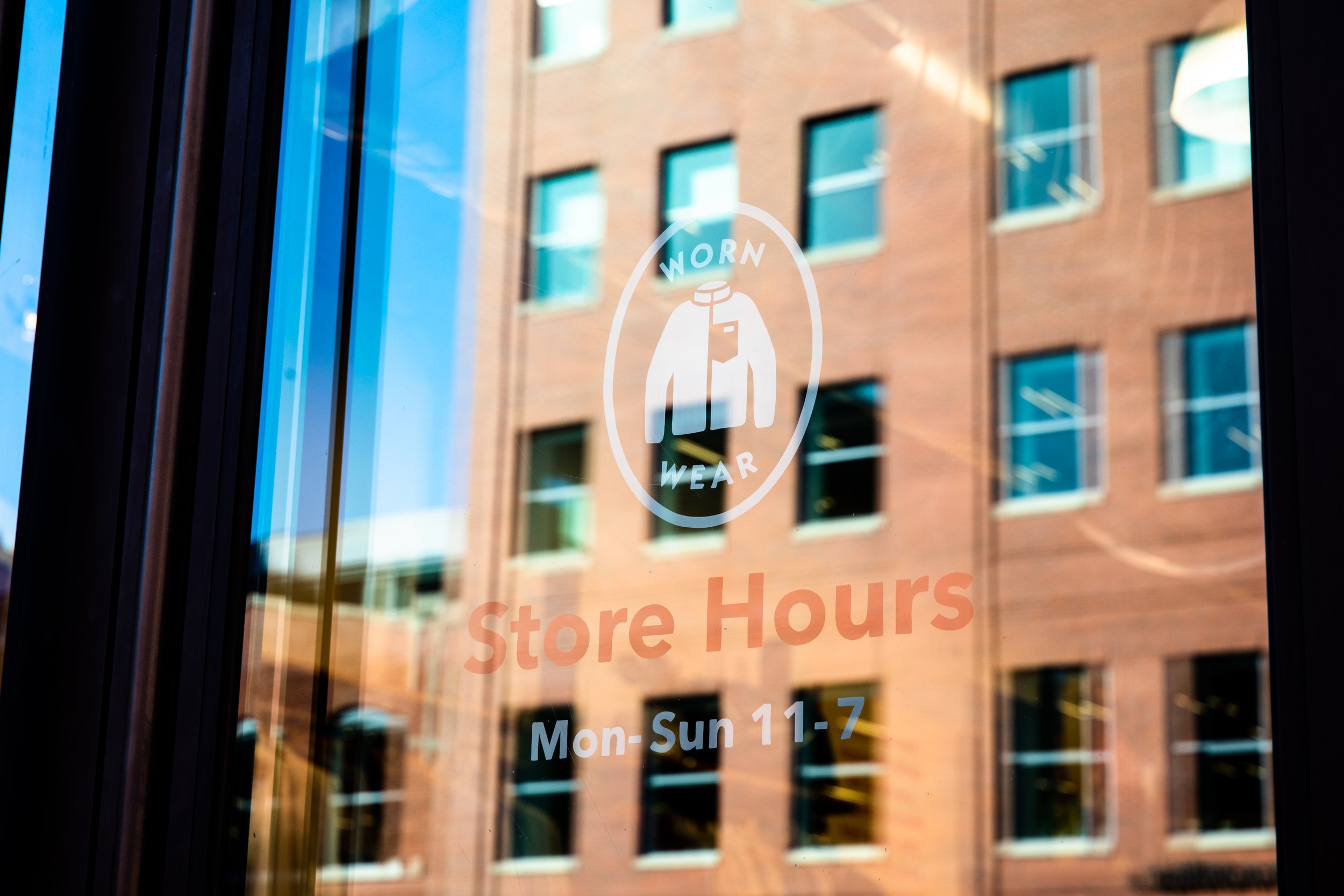
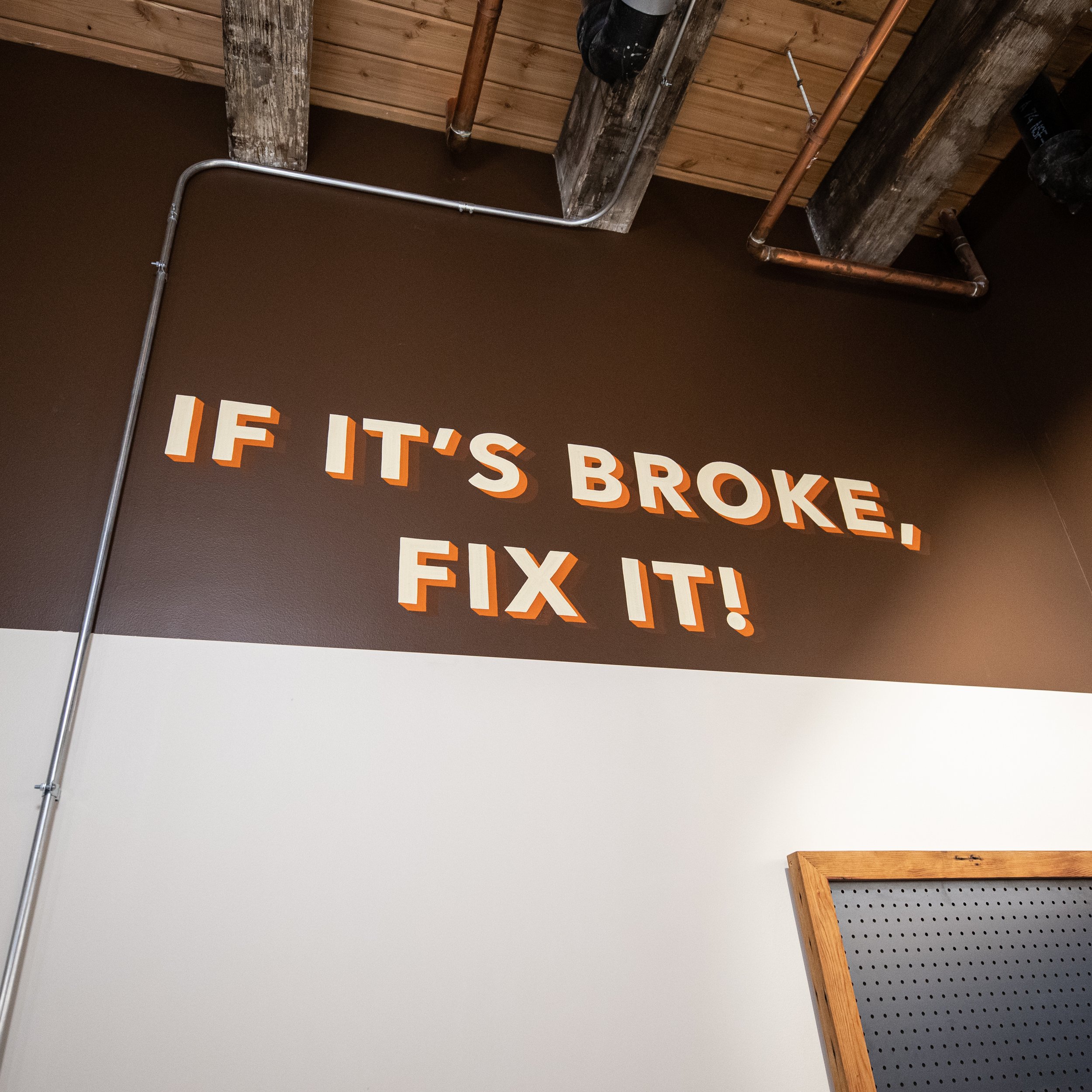
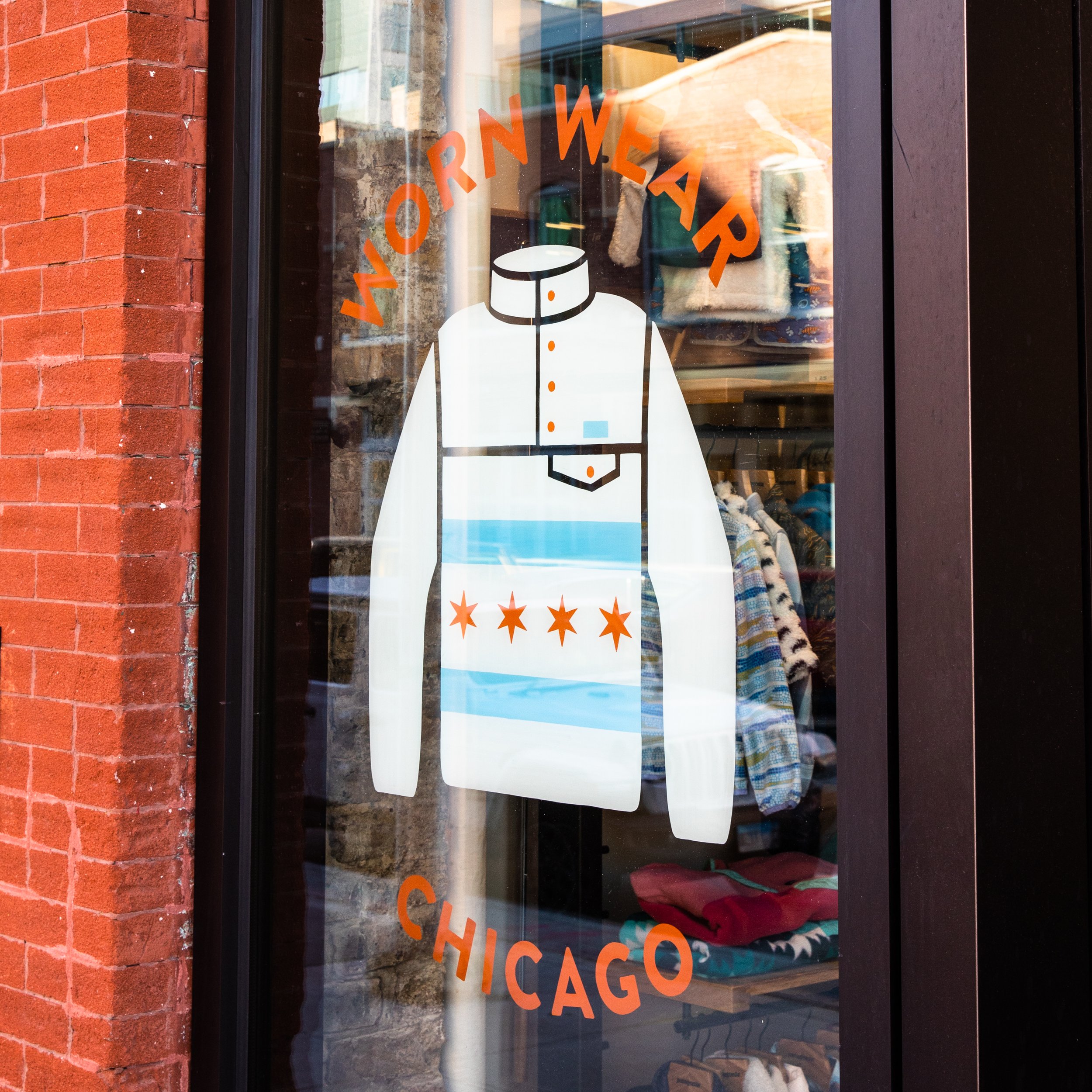
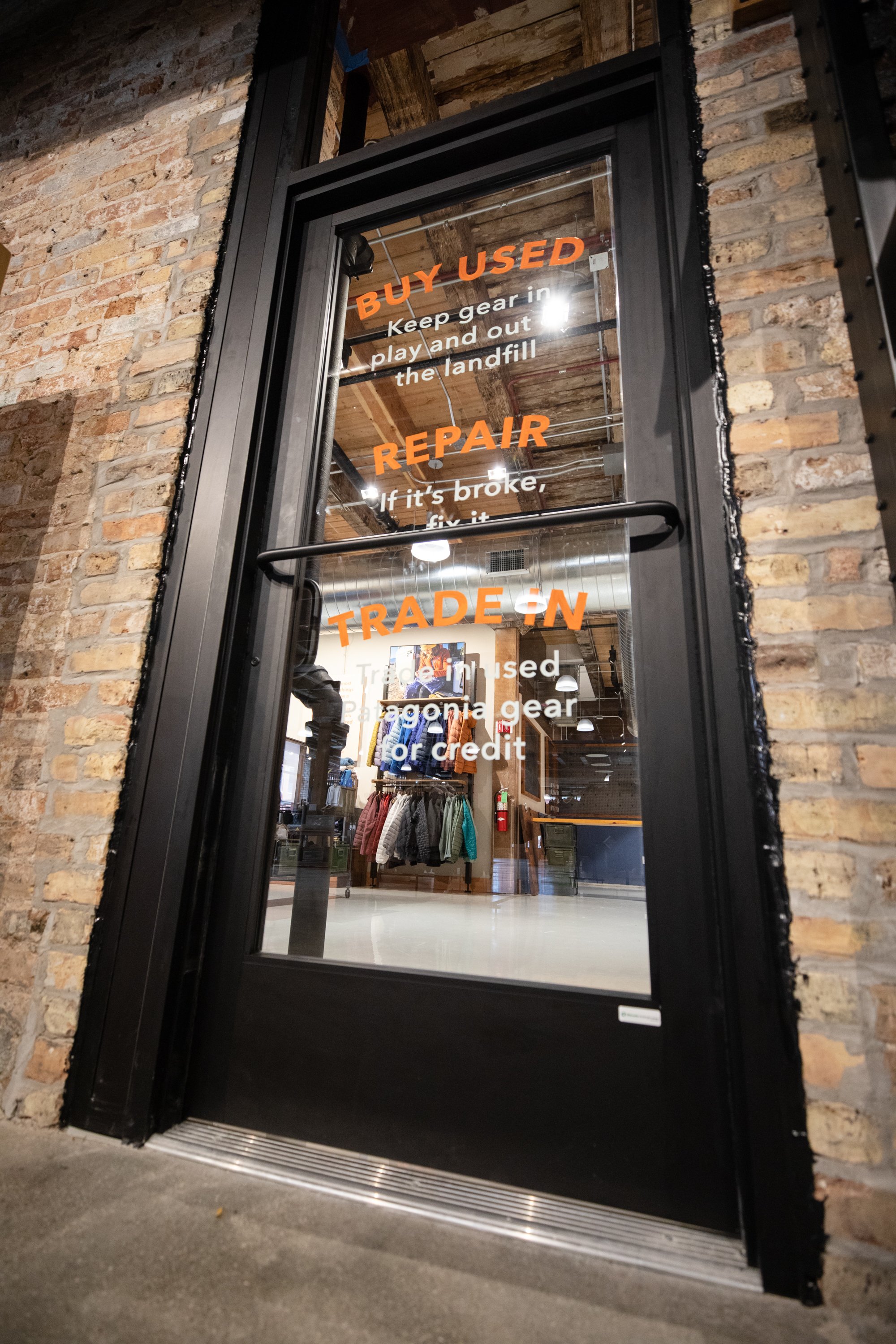
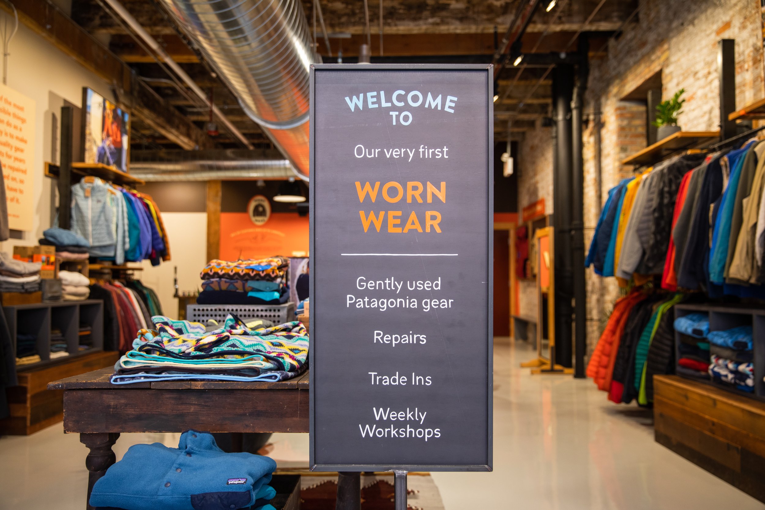
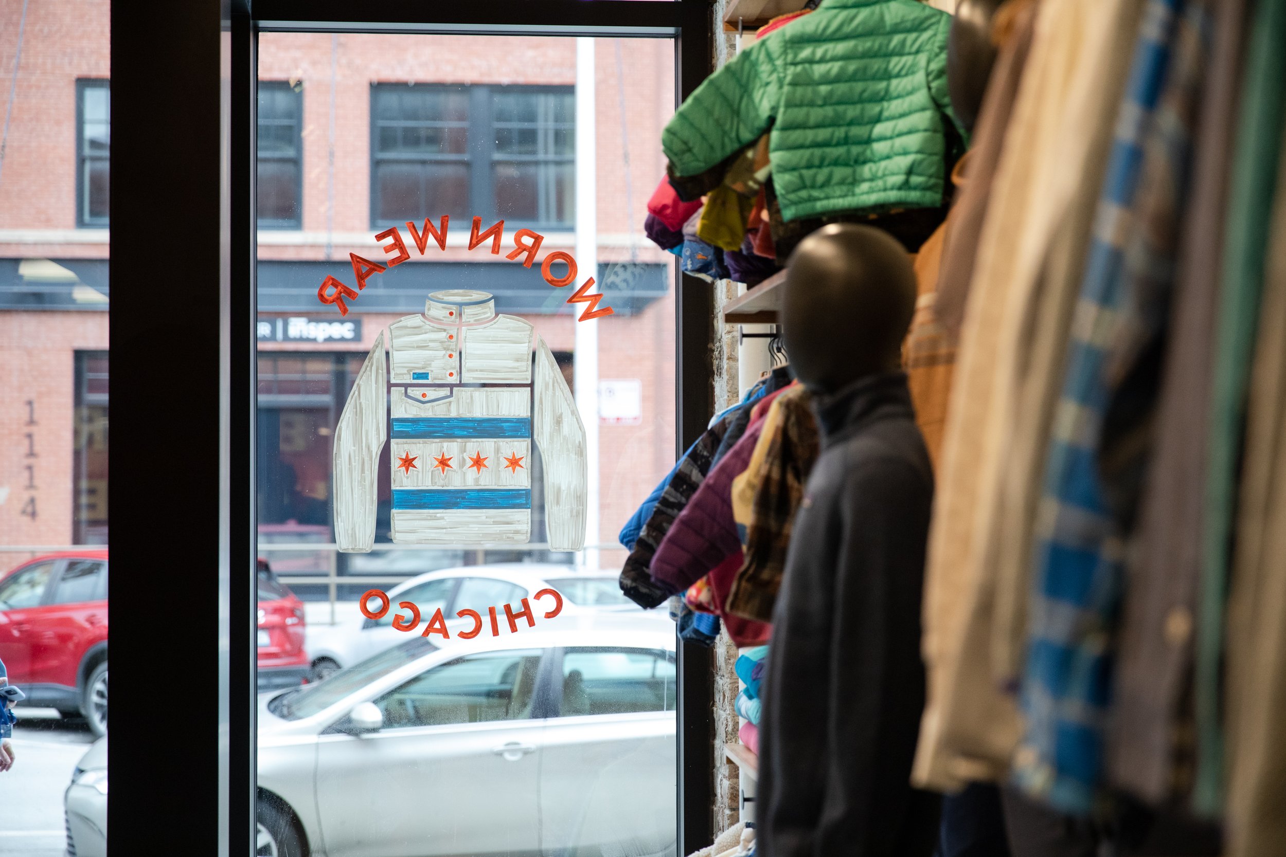
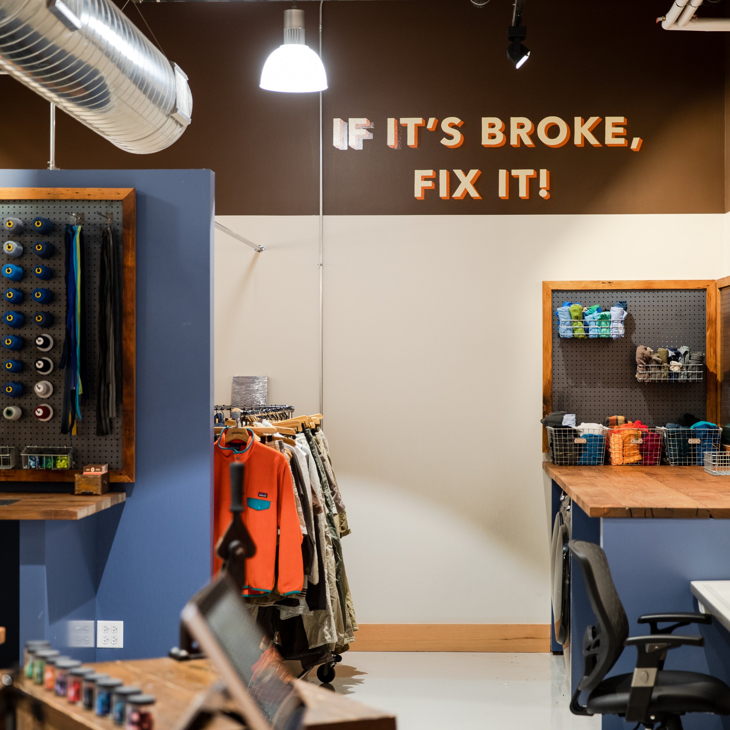
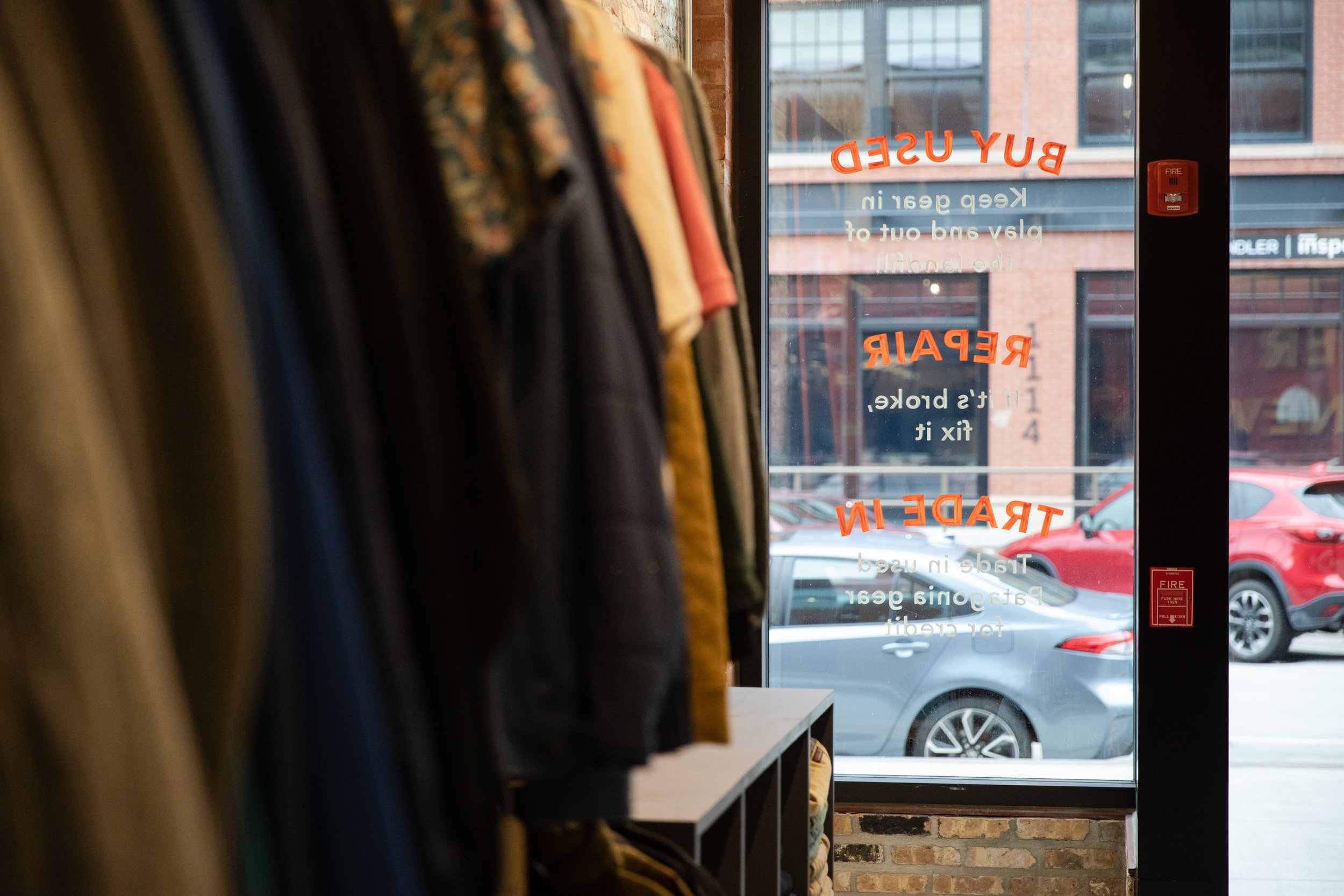
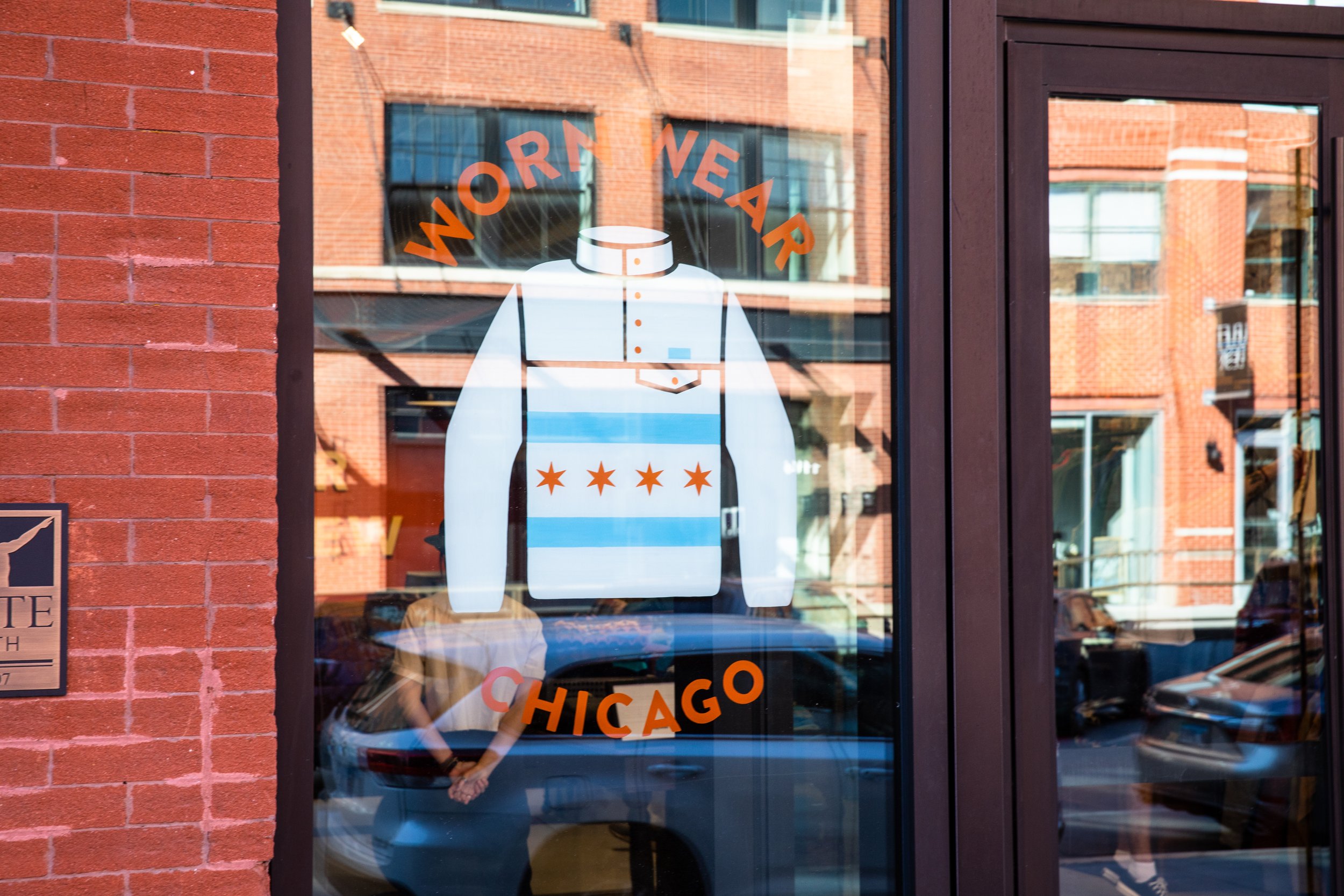
WORN WEAR CHICAGO
PROCESS:
For the first ever flagship location of Patagonia’s Worn Wear, we worked within a developed style guide of the previous traveling pop-up store. All designs were provided to us to paint by the Patagonia team, unless stated otherwise.
Take a look at our painted works for the first ever Worn Wear store: